Operating System Overview Android 7.0 Nougat. We consider the main changes, innovations and features of the new version of the system …
Content
- Foreword
- Interface
- Desktop
- Application menu
- Lock screen
- Multitasking
- Application Manager
- Fast window switching
- Multi-window mode
- Notification panel
- Notification cards
- Quick response
- Switch panel
- Other changes
- Scaling
- Data Saver
- Settings menu
- Secrets and Easter eggs
- System UI Tuner
- Night mode
- 'Easter egg'
- Outcome
- We go to the settings section 'About phone' and several times in a row with the line with the OS version.
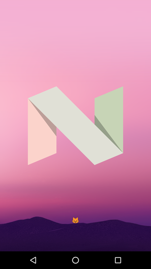
- After the letter 'N' appears on the screen, we continue to tap on the screen with your finger. If everything is done correctly, a tiny cat's face the size of a regular smiley will appear on the screen.
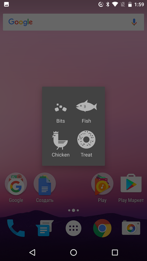
- One new switch should appear among the available switches in the notification shade. We take it out in a prominent place, choose the food with which we will lure the cat.
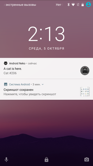
- After some time, a notification will come to the phone that a cat has appeared nearby. I didn't quite understand how to catch it, it seems like it's enough to just tap on the notification.
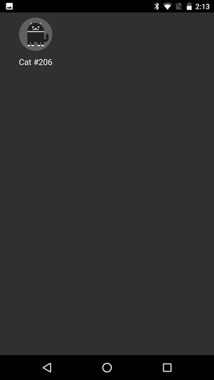
- Cats can be given unique names and (it seems) to exchange them with each other.
Foreword
One of the features Android is the absence of strict hardware requirements and the ability to use it on a variety of devices. For manufacturers, this means complete creative freedom, almost unlimited. In theory, anyway.
At first, manufacturers really actively used the opportunities that had opened up, continuing to develop the idea of smartphones and even trying to create fundamentally new classes of devices. The so-called phablets appeared, which were supposed to become handheld computers, tablets suddenly 'fired off', here and there transformer devices began to appear, combining two or three form factors at once …
But very quickly it turned out that there was no fundamental difference between a small Android smartphone and a huge spade phablet. A compact device is more convenient to use as a phone, while a 'shovel' with a large diagonal is more comfortable to view websites and videos, but that's all. Otherwise, they are similar, like twins, and are designed to consume the same content. With tablets, the situation was a little better, for very undemanding users they really were able to replace laptops, but there weren't really any new use cases here either. In fact, tablets were just overgrown smartphones and were not intended for serious work in the same way.
Some devices stood out from the general background and tried to give customers something more than just a giant screen. But thanks for that should be said to individual manufacturers, not Google itself. The same Galaxy Note turned out to be popular for a reason, and good hardware is by no means the main component of its unexpected success. It's just that, unlike many other companies, Samsung tried to endow its phablet with unique qualities, to show that it really is little more than a simple phone. That a large screen can give the user something other than an enlarged picture.
After the dubious success of Android 3.x, Google was deliberately slow to tackle a new class of devices. The main task of the developers was to provide the best possible user experience on traditional smartphones, and only then take on something else. And there was no longer any question of splitting the system into two independent branches again – Android had to remain a single OS and all innovations had to be equally well optimized for all existing devices.
Many criticize Android 6.0 for the lack of major changes, believing that this update does not deserve a separate number. There are certain grounds for this point of view – although there were enough changes (both noticeable and imperceptible to a common user) in Marshmallow, there really was no fundamental difference with Lollipop. Yes, probably, it shouldn't have been, because, first of all, it was working on mistakes and correcting minor bugs.
With Android 7.0 Nougat, the situation is different, for the first time in the last few years it is not just about the systematic development of the old concept, but about the first step to something greater. Including in the most direct sense of the word. Considering that everything has become more or less good on (conditionally) compact smartphones on Android, the company finally drew attention to the problems of more 'serious' devices.
What does this mean in practice? On the one hand, in Android a number of additional features and modes of operation appear, more focused on devices with a large screen diagonal. On the other hand, users get a little more freedom and can influence those things that were previously regulated exclusively by the system itself. But all changes take place very carefully, and the main principle remains the famous 'do no harm'.
Back to content >>>
Interface
Google is famous for its love of redrawing the interfaces of its services. And although Android falls under the definition of 'service' with a stretch, at one time it also got it in full. 'Drawn' style Android 2.x, 'space' Android 3.x, experimenting with light themes and 'card' designs in minor versions Android 4. x, Material Design in Android 5.0 … the green robot changed faces like gloves, and even Google itself did not always have time to redraw the interfaces of its applications in accordance with the new rules.
At Material Design, the constant throwing of designers from side to side finally stopped, they were more or less satisfied with the overall picture and now they are finalizing each element of the interface separately. In Android 6.0, the developers completely redesigned the application menu, in the 'seven' it was mainly the 'curtain' of the notification panel that got it.
Back to content >>>
Desktop
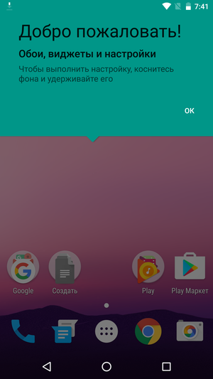
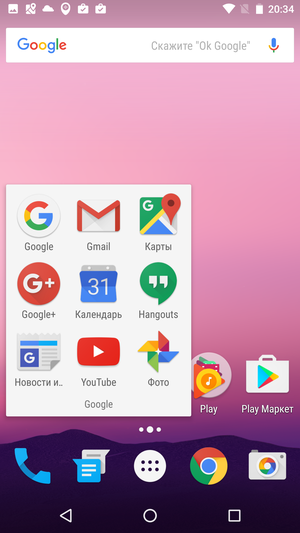
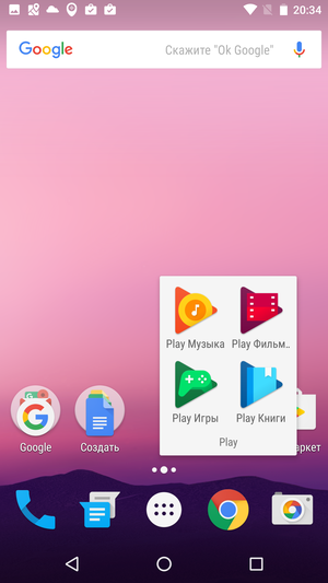
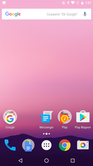
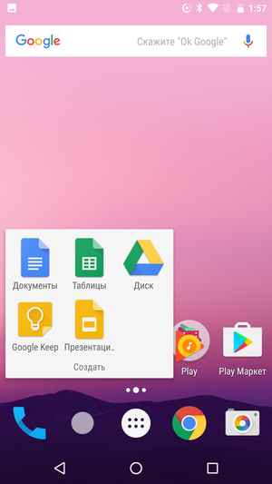
By default, the system uses one desktop, on which Google has carefully placed folders with icons of its branded services. Many users hoped that the round folder icons in Android 7 would be replaced with square ones, but this did not happen. Application icons are still located on the common icon with a 'ladder', and it can be difficult to understand what exactly is hidden behind the first icon.
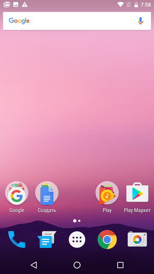
When opened, the folder looks like a white rectangle with a list of icons, its name is displayed below. The icons inside the folder can be freely swapped, which allows you to place the most frequently used applications right under your finger.
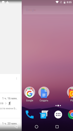
To the left of the home desktop is the Google Now screen. On the one hand, this is convenient, because the Now on Tap contextual search is assigned by default to a long tap on the Home button. On the other hand, you cannot assign a home screen manually because of this, it will always be the first desktop.

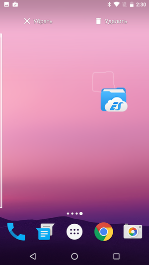
To create a new desktop, just drag the shortcut to the edge of the screen, and then move it to the screen that appears. The long-awaited multitouch support did not appear – you cannot 'pick up' the icon with one finger, but you cannot scroll the screen with another. Empty desktops are removed automatically
From the desktop, you can remove both the icon and the program itself with one movement. To do this, just drag the icon to a special area at the top of the screen.
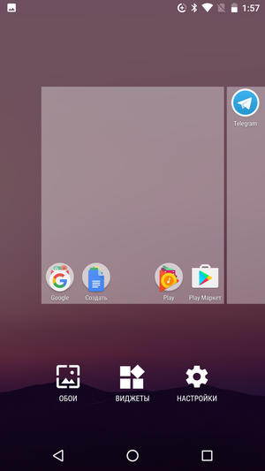
The dock bar is a visual continuation of the desktop, has a transparent background, a similar number of icons and also has support for folders. The user can change all the icons, except for the central one, to which the launch of the application menu is assigned. A long tap on the same icon starts the search. Just above the dock area is the desktop indicator, which shows their total number and the currently active screen.
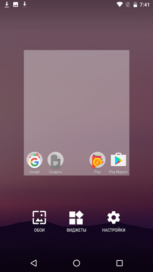
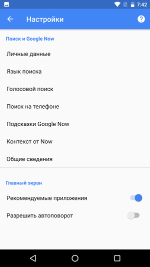
A long tap on the free space of the screen activates the desktop editing mode. Using the icons at the bottom of the screen, you can change the wallpaper, bring additional widgets to the desktop, or go to the screen and Google Now assistant settings. Of the interesting features, it is worth noting the automatic change of the screen orientation, which works in the launcher itself.
In the landscape orientation, working with the phone is just as convenient as in the vertical one. The main problem here is the widgets, some of which are not adapted for landscape mode in the best way (or not adapted at all).
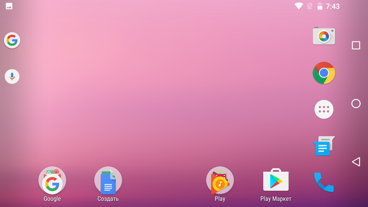
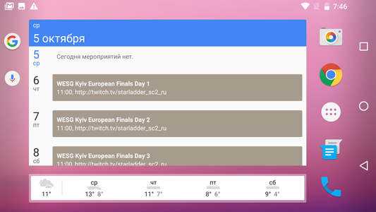
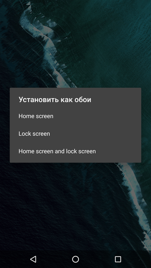
The wallpaper selection menu migrated from Marshmallow almost unchanged, but now users finally have the ability to assign different backgrounds for the desktop and lock screen. Third-party skins have had this feature for years, but Google itself has stoically ignored it all this time.

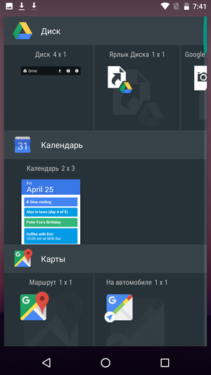
The design of the list of widgets has remained almost unchanged since Android 6.0. This is the same vertical list in which each application has a separate line. If one application has several different widgets at once, then on the line with their thumbnails there will also be horizontal scrolling. There is a green 'slider' on the right side of the screen, if you pick it up with your finger and drag it down, the screen will show the letter of the alphabet to which you scrolled through the list.
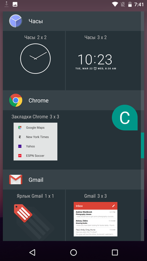
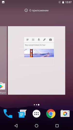
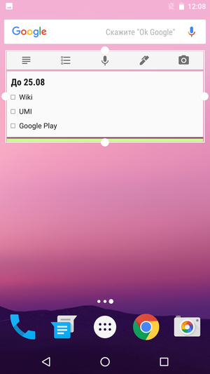
Many widgets can be resized – this is a standard feature Android that has been in the system for several years. To do this, it is enough to make a long tap on the widget installed on the desktop and pull on its edge.
Back to content >>>
Application menu
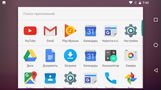
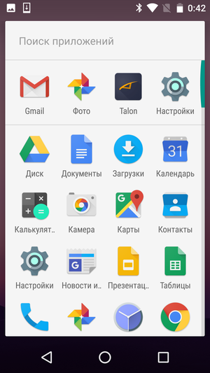
The most controversial innovation Android 6.0 Marshmallow was the new application menu. Some users were annoyed by its bright white background, others were frustrated by the forced sorting of icons in alphabetical order, while others lacked additional features such as support for folders or the ability to hide unnecessary icons. Nevertheless, Google continues to stubbornly hold on to the new design, flatly refusing to change anything in it. There are some minimal differences, but you will have to look for them with a magnifying glass – the borders of the interface elements are drawn a little differently, shadows have been added, and so on.
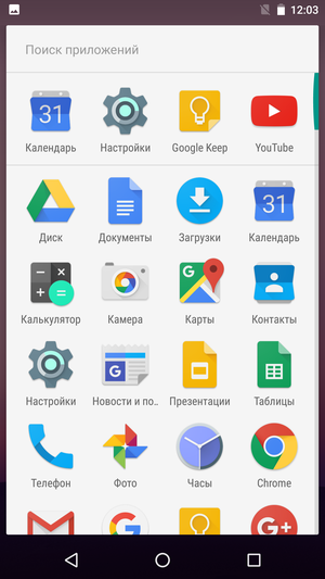
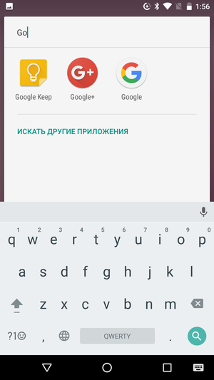
The first line of the menu is still occupied by the icons of the most popular applications, a little higher is the search line. If the application you are looking for is not found on your smartphone, you can continue your search in Google Play itself.
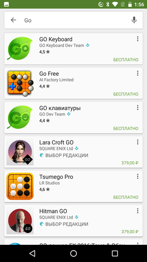
The rest of the screen area is occupied by a list of icons, which has vertical scrolling. Theoretically, the screen grid here is 4×6, but because of the 'sticky' search bar, the top row of icons is partially hidden.
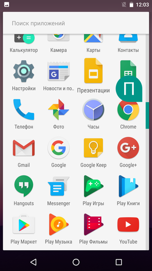
You can scroll through the list using a standard swipe or using the green 'slider' on the right side of the screen. In the latter case, the screen will display the current letter of the alphabet, and the icon of the first application starting with it will slightly increase.
From Google's point of view, the application menu is like the Start button: a list of the most used applications, a built-in search bar, sorting in alphabetical order, and so on. The ability to hide, arbitrarily group or distribute icons into folders was not added here for a reason – the menu should remain as simple as possible a directory where the user can easily find what he 'lost' on the desktop. After all, there, as much as you like, you can distribute icons on different screens, group them into folders, or even delete them out of sight.
Back to content >>>
Lock screen
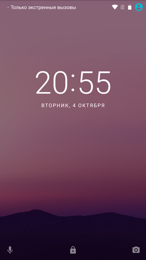
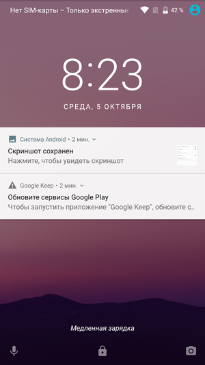
The lock screen has not undergone any global changes. Now you can set a background image on it that is different from the desktop wallpaper. The animation has changed a bit, and definitely for the better. In order to open the 'curtain' of the notification panel to the full screen, now it is not necessary to reach the top edge of the screen – any horizontal swipe will do. Unless memory changes, this was not possible in 'clean' Android 6.0.
At the bottom of the screen, you can see the familiar shortcut icons that allow you to launch the Google Now assistant or smartphone camera without entering a password or pattern. You cannot replace them with something else.
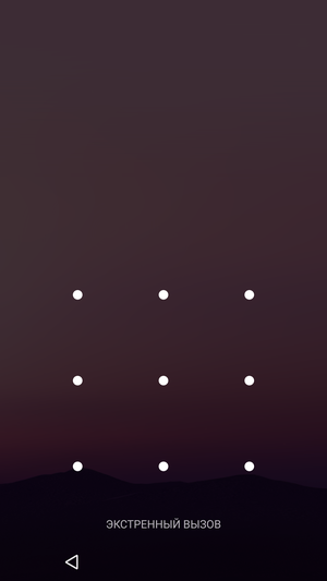
If the smartphone has a fingerprint scanner, then it can be used to quickly unlock the smartphone. The lock at the bottom of the screen will change to a fingerprint image. But even when using a fingerprint sensor, the user will still be required to choose an alternative unlock option, which will be used after five unsuccessful attempts to read the fingerprint.
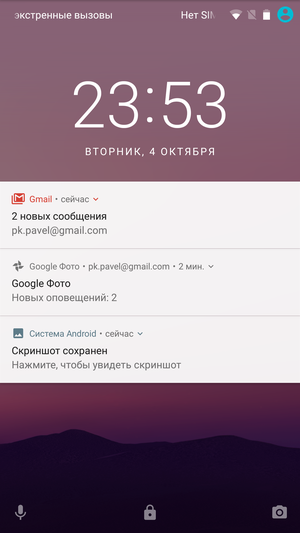
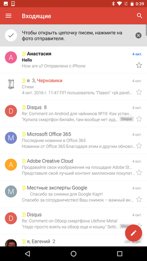
As before, when setting up a password, you will need to select one of several notification display modes: 'Show notifications in full', 'Hide personal information', 'Don't show notifications'. The difference between the first and second option is shown in the screenshots below. But the notification cards themselves have changed significantly, which we will talk about in the next section.


During charging, it is now shown whether it is 'fast' or 'slow', which allows you to estimate when you can approximately unplug your smartphone from the outlet.
Back to content >>>
Multitasking
The ability to simultaneously work with several programs is one of the main differences between a smartphone and a phone. Some of the owners of 'smart' technology use a large set of applications, some smaller, but very few people are ready to completely abandon multitasking support and return to ordinary 'dialers'.
However, multitasking is not implemented in mobile devices in the same way as in desktop devices, due to a bunch of different factors. From hardware performance and power consumption to differences in screen sizes and typical usage scenarios.
In general, the position of the developers was very simple. A smartphone is a smart phone, not a tiny laptop; it just doesn't need full multitasking. And if on this front in recent years that has changed, it is more in the direction of simplification – applications were forbidden to be too active in standby mode, 'wake up' the smartphone for all sorts of trifles, and so on.
A smartphone is really not a computer. But it is no longer a 'smart pipe'. Including from the point of view of banal dimensions – to recognize a miniature push-button telephone in a five-inch 'shovel', you need to have an extraordinary imagination. I'm not even talking about phablets, tablets and transformer devices, they are not much closer to phones than people are to monkeys.
New hardware and new use cases have long required both new software and a new approach. And in Android 7.0 the ice finally broke.
Back to content >>>
Application Manager
Almost from the first years of its existence Android, Google Play was littered with various 'cleaners' and 'optimizers' of RAM, and in every second proprietary shell there was a button 'Clear memory' or 'Close all applications'. Google, however, persistently continued to repeat its mantra – “The system knows better than you what and when to unload it from RAM, so just use your smartphone and do not poke your nose into other people's business.” The ability to close applications one by one was still left for users, but there was no question of any 'Close all' button.
In Android 7.0, Google engineers gave up and added this long-awaited key to the Application Manager. True, they placed it at the very end of the list of open windows. Not so that users do not abuse it, not just so that life does not seem like honey. So in order to use it, you have to scroll the list of open windows to the very end.
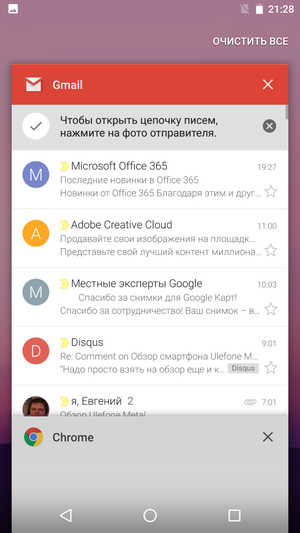
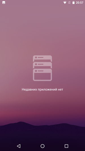
By the way, they promised to limit the maximum number of cards in the application manager. If earlier the list could swell almost indefinitely, now there should be only seven miniatures in it. At the same time, the number of running applications itself is not limited or regulated in any way, here, as before, everything depends on their weight and the amount of RAM.
I don’t know if Google nevertheless changed their plans at the last moment, or if it worked somehow wrong on my Nexus Android, but I had more than a dozen cards in my application manager without any problems.
Back to content >>>
Fast window switching
While working on a laptop or PC, you almost certainly have several different programs running at once. At the same time, it is far from always necessary to display all open windows on the desktop at the same time, sometimes it is more convenient to work in full screen mode and just switch between applications using alt + tab. Switching between windows takes a split second and is as natural as opening a folder with a double click or selecting text with the mouse cursor.
At first glance, it might seem that in Android, switching between open applications is a little more complicated. All you need is to call the application manager and tap on the window of the desired program. For a 'phone' use case, where switching between apps occurs at best a couple of times a minute, this is indeed the case. But when working closely with several programs, when you have to constantly switch back and forth between two or three open windows, this is extremely tiring. For example, when you work with text and a dictionary open in the second window, compose a document based on data from letters and chat, try to write out the names of the most successful pictures from a photo album, and so on.
In Android 7.0, the way of switching between windows was partially changed. Firstly, when the task manager is called, the window of the active program now goes to the very bottom of the screen, so that the window of the second application is right under the fingers. Switching between apps quickly is now easier, especially if you do it with one hand.
Secondly, opening the Task Manager to switch between the last two windows is no longer necessary at all. You just need to double tap on the 'Multitasking' phone key (aka 'Review'), and the switch will happen automatically. It turns out even faster than the notorious alt + tab, even if it works only for two windows.
Back to content >>>
Multi-window mode
Switching to multi-window mode is done by long pressing the 'Multitasking' button. This will split the screen into two parts, allowing you to open one of the minimized programs next to the current window.
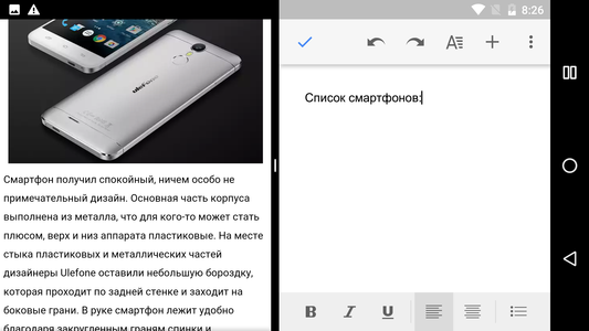
It is not necessary to divide the screen strictly in half, the border of the windows can be shifted either in one direction or in the other direction. Typically, the application interface changes to accommodate the new window size.


Working with multiple application windows at the same time is important primarily for devices with a solid screen size. As a matter of fact, this is the first serious attempt to somehow justify and use this diagonal. But even on relatively compact smartphones (read, five-inch 'shovels'), the multi-window mode can sometimes come in handy.
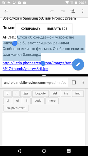

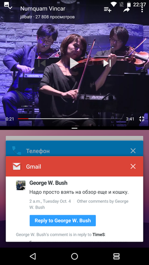
The most common example is music videos or YouTube streams. Firstly, you can't just shutdown YouTube – playback will be interrupted immediately. Secondly, listening to the game stream without seeing the pictures is below average pleasure in any scenario. Using the new (for 'clean' Android) multi-window mode, you can easily position the YouTube video window at the top of the screen, and work with other applications at the bottom. At the climax, you can stretch the video window to 2/3 of the screen with one movement, or even switch to full-screen mode.

A slightly less banal example is rewriting text from a photographed business card or document. Having the original in front of your eyes is much more convenient than constantly switching back and forth, getting confused in unfamiliar names and phone numbers. Although it is still not very comfortable to do this on compact smartphones – the on-screen keyboard takes up too much space.
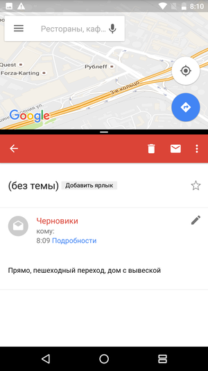
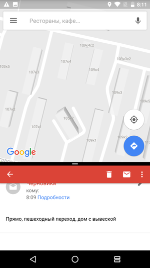
Support for quickly switching windows by double tap is also not gone anywhere, which allows you to comfortably work with three applications at once. For example, at the top of the screen you keep the same stream, and at the bottom you quickly switch between WhatsApp chat and a movie site, while discussing with your friends which movie you should all go to.


At the moment, not all applications support multi-window mode, although every day there are more and more of them. Yes, and not everything is working perfectly yet – some programs do not support copy / paste functions, others have problems with scaling, and so on. The solution of such problems is exclusively a matter of time, and the nearest time.
Back to content >>>
Notification panel
Another major difference between a smartphone and a phone is the level of application integration into the system. This is also reflected in the support of notifications. The smartphone constantly monitors incoming correspondence, software updates, scheduled appointments, weather changes and many other things. And he does not forget to inform the owner about everything he needs to know.
One problem is that the more programs a user uses, the more different notifications he receives. From emails, news and SMS to gaming events, new photos in a shared album and popular streams on YouTube. The smartphone is constantly ringing, vibrating and flashing an LED, notifications are superimposed on one another, and the status bar 'curtain' almost bursts from the number of cards. At some point, the user simply stops responding to sound notifications, and important messages are lost among secondary information.
In Android 7.0, the status bar 'curtain' and the notification system were seriously updated, which became one of the most long-awaited and useful innovations for me.
Back to content >>>
Notification cards
The design of the notification shade has been significantly redesigned. At first glance, it may seem that the design of the notification cards has only slightly changed, but otherwise everything remains the same. But, in fact, the changes are much more serious.
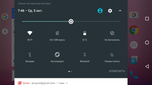
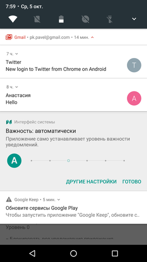
The first thing that catches your eye is the miniature toolbar, which is located just above the notifications. You can now turn on WI-Fi, use a flashlight or block automatic screen rotation right from here, without having to go somewhere else.
Secondly, notification cards have become more compact and informative. And, most importantly, they now also support multi-level grouping. Previously, when you received several notifications of the same type, your smartphone would tell you something like 'Hey, you have two letters of some kind here! But I won't tell you who they are from, so if you want to figure out what's what, quickly run to the mail client, and I have enough of my own problems. ' And now it is immediately clear who wrote what to you, and with one slight movement of the hand, the group of notifications can be expanded, skimmed through the list of letters with your eyes and all unnecessary messages can be immediately thrown into the archive.
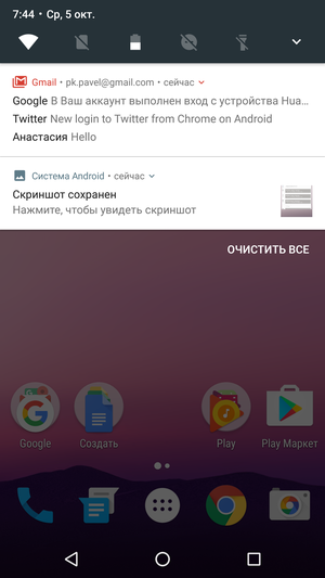
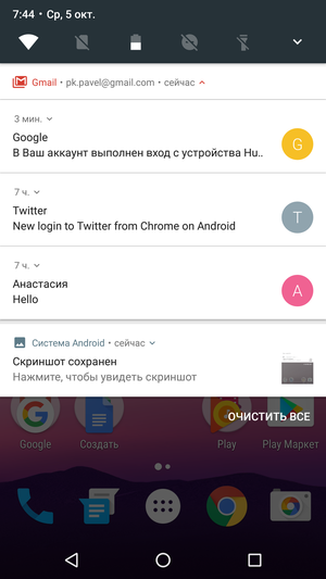
In general, working with notifications has become much more pleasant and faster.
A long tap on any notification allows you to tell your smartphone how to behave with this application further. You can block all further notifications, or you can simply mute their sound.


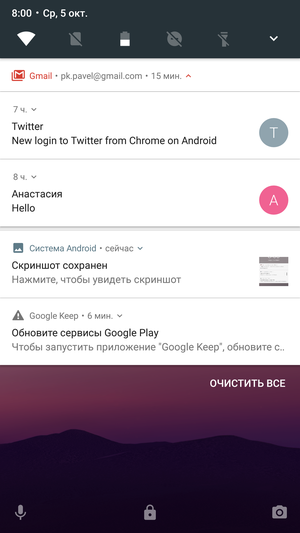

Back to content >>>
Quick response
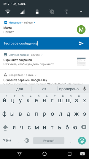
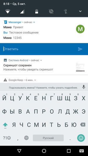
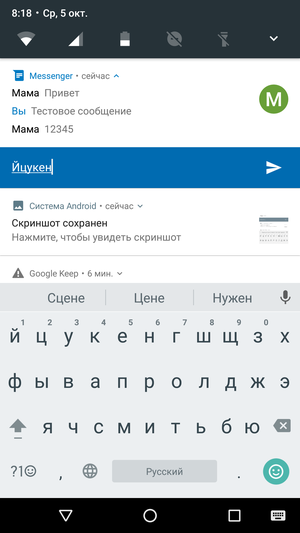
For Android smartphones, the quick answer is that the feature is far from new, but it appeared for the first time in a 'clean' OS version. Having received a new message, you can reply to it directly from the 'curtain' of the notification panel without opening the messenger itself. Moreover, the notification card will show not only your last answer, but the entire dialogue.
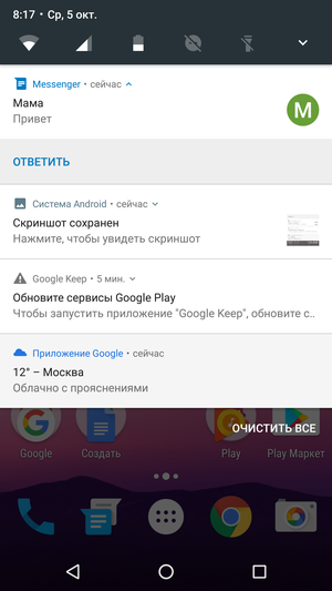
Back to content >>>
Switch panel
Above, I already mentioned that the main switches are now displayed immediately in the notification shade. In the screenshots, you may have noticed that the set of switches is somewhat non-standard, for example, there is a battery icon, which is not clear to whom and why.
The point is that in Android 7.0, many switches began to behave differently. Many of them can hardly be called even switches now. So, clicking on the Wi-Fi icon no longer enables or disables the module, but opens a pop-up window with a list of available wireless networks. A tap on the battery icon does not just switch the smartphone to an energy-saving mode of operation, but demonstrates the battery discharge graph and the projected operating time.
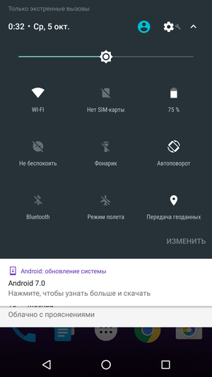
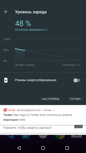
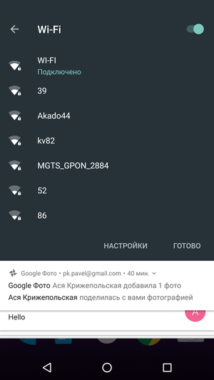
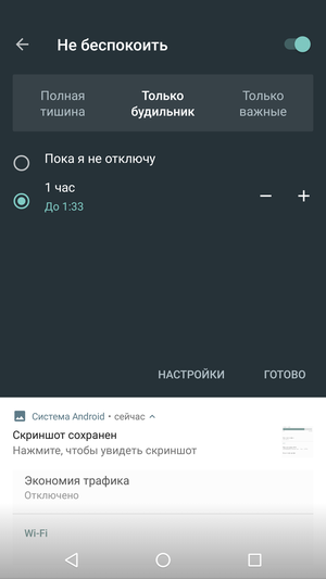
How logical this behavior of switches is, you can argue for a long time. Those who are used to constantly enabling and disabling wireless interfaces will clearly be unhappy, because now they have to do one more click to achieve the same result. But the rest of these changes are likely to please. For example, I much more often go to the Wi-Fi section to select a wireless network, and not at all to enable or disable the module itself.
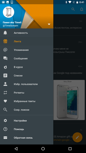
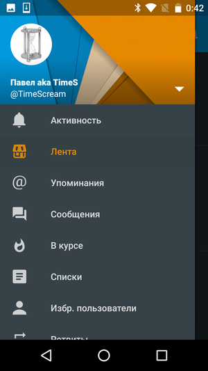
Finally, the set and order of switches were allowed to be changed without additional 'dances with a tambourine'. Interestingly, in addition to the 'standard' switches, third-party application switches are now supported. So, in the screenshot below you can see the Talon Twitter client icon. The opportunity itself is interesting, but everything will depend on the software developers themselves.
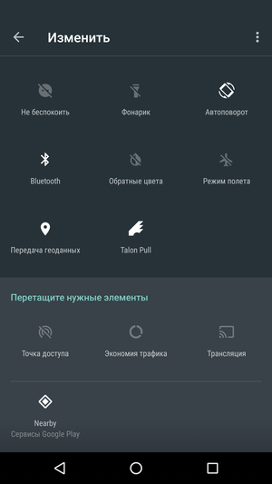
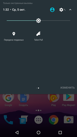
If you bring too many icons to the switch panel, then it will have a second screen. Switching between screens is done with a horizontal swipe.
To content >>> To content >>>
Other changes
Scaling
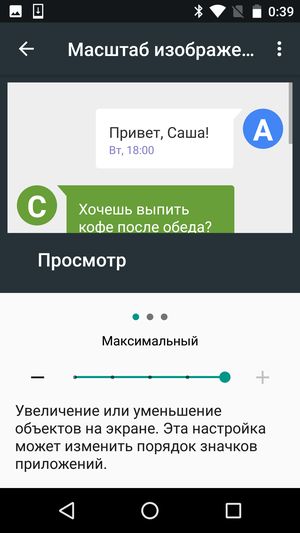
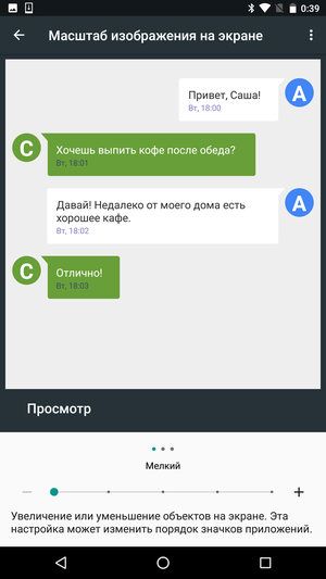
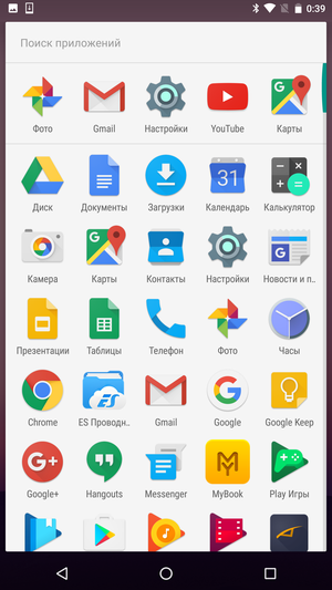
Android has long allowed changing the font size, but not the size of interface elements. Now the system finally has full scaling (dpi). This is another step towards making the use of the system as comfortable as possible on any device, not just 'average' ones. Including, use the free screen area to the maximum.

Back to content >>>
Data Saver
The more actively the user uses his smartphone, the more traffic the device 'eats'. Mobile Internet is not a free pleasure, and the amount of traffic included in the monthly fee is usually severely limited. Especially when it comes to business trips and travel.
The new Data Saver mode helps to reduce traffic consumption by preventing applications from wasting precious megabytes just like that. For example, additional images will be loaded only when you point your finger at them, and so on.

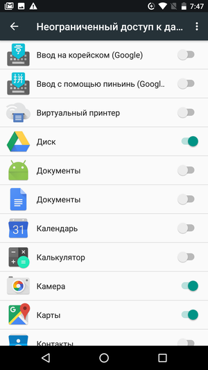
The most important applications for you can be added to the white list, they will not be subject to any restrictions.
Back to content >>>
Settings menu
The list of options available for customization and their grouping by sections and subsections is an eternal problem for any manufacturer. It is almost impossible to please all users here, because some require a bunch of additional functions, while others manage to get lost in three menu items.
'Regular' users will never simply study the list of settings, if they have already opened it, then for some specific purpose, and not just 'to look'. Even if in the next menu item there is some option they really need, they will never know about it.
“Advanced” users do not enter the smartphone settings very often, but they have a rough idea of what and where to find there. How conveniently the options are broken down by menu items, they are no longer too interested – the main thing is that everything remains in its place and they do not have to re-figure out what and where the developers have moved.
Geeks know all the features Android by heart, but they are still unhappy with the list of available options and prefer using third-party launchers or firmware.
Most buyers belong to the first category, which is why the manufacturer is always tempted to cross out all the underpopular items from the list of settings. Let the 'geeks' be unhappy, but the bulk of buyers will easily figure out what's what, and will not be indignant about how complex and incomprehensible OS it is. And you won't have to spend time developing and optimizing options that most people won't know about anyway.
At one time, Google also tried to play this game, and often there was simply no logic in such 'simplifications'. These or those basic options simply disappeared from the system (separate volume control, display of charge in percent, and so on), although it was unclear what and who they interfered with. Such a solution to problems was very reminiscent of the method of the Queen of Hearts – first, head off, and then we will figure it out.
Fortunately, the company changed its mind in time and found the strength to go the other way.
First of all, it was necessary to put things in order in the settings sections, which caused a nervous tic among new users. The first timid steps in this direction were made in Android 6.0, where 'hidden' sections of settings for geeks and additional submenus for very 'fine' settings appeared.
But breaking down all the options into subcategories is only half the battle. The resulting list should be not only convenient, but also intuitive for any beginner. To do this, in Android 7 we have seriously changed the appearance of the menu.
First, a side menu has appeared in the settings section, which allows you to navigate to the root category from any submenu.
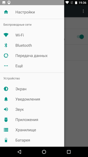
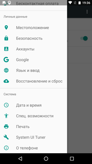
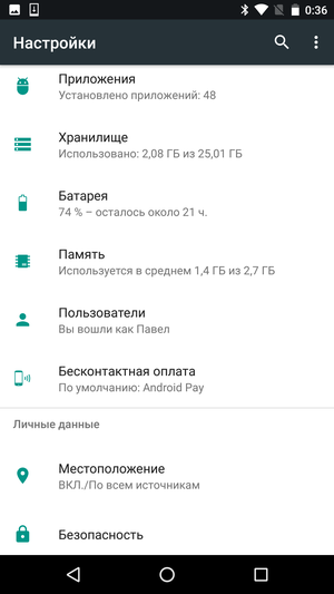
Secondly, the main information is now displayed under the section name in the main menu. On the card of the 'Battery' section, the current charge is visible, near the inscription 'Wi-Fi' the active network is indicated, in the 'Display' item the selected brightness is displayed, and so on. On the one hand, this eliminates the need to make unnecessary clicks, on the other hand, it shows better verbose descriptions where and what information can be found.
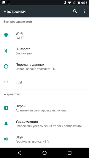
The next step is a kind of educational work. When an inexperienced user enters the settings menu with a dozen categories and hundreds of options, his eyes simply run wild. And instead of hoping that he will learn all the functions on his own, it is better to immediately prompt him the most useful 'tricks' and important innovations.
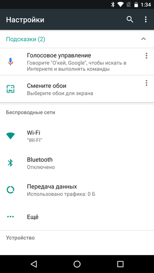
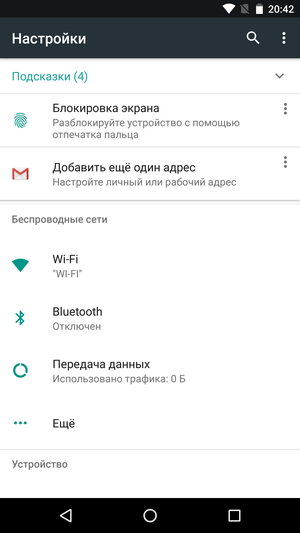
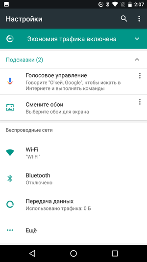
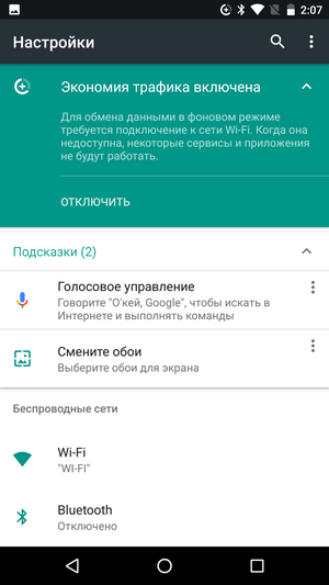
To do this, in Android 7.0 a system of hints appeared, which are displayed at the top of the menu. Here they will remind you how to set up voice search, add an additional mailbox to Gmail, use the fingerprint scanner, and so on. This is a kind of 'Tips for Dummies', which is unlikely to interest experienced users, but it will make it much easier for everyone else to configure the device.
Back to content >>>
Secrets and Easter eggs
I will not describe in detail all the settings sections, there are at least changes in comparison with Android 6.0 here. A few words should be said about the 'secret' section.
 Operating System Overview Android 6.0 Marshmallow Back to Contents >>>
System UI Tuner
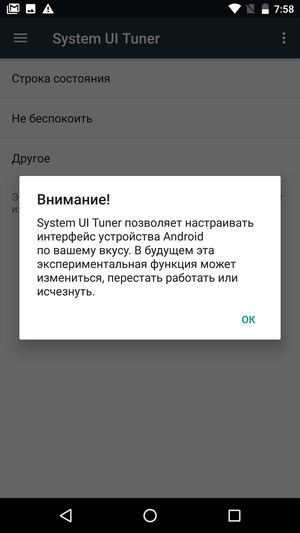
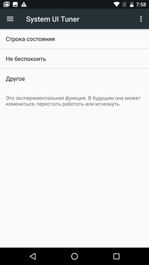
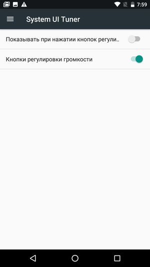
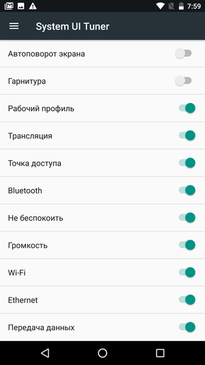
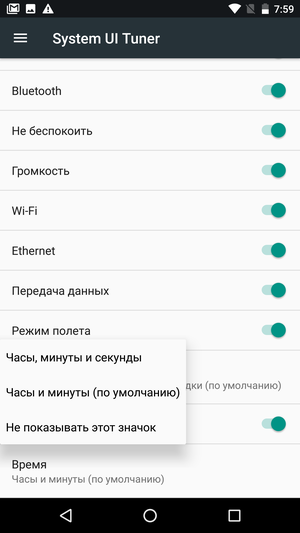
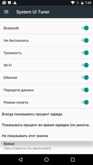
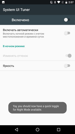
The System UI Tuner section remains hidden in the settings menu, although the set of options in it has changed. Let me remind you that it is not difficult to activate it – just press and hold for a few seconds the gear icon, which is on the switch screen in the notification panel shutter.
This section contains several additional options that Google, for some reason, did not dare to put on public display. In the future, the section may be changed or removed, which Google honestly warns about from the very beginning.
Among the interesting functions, I would like to note the fine tuning of the notification behavior, the choice of icons in the status bar and the display of the percentage of the battery charge.



Back to content >>>
Night mode
Many modern users do not part with a smartphone day or night, and even during a walk they walk with their nose buried in the screen of their phone. For the eyes, this is, to put it mildly, not useful. Moreover, the main danger is represented by the short-wave part of the color spectrum, that is, blue and violet colors. It is possible to neutralize the harmful effect both with the help of special glasses with tinted lenses, and with the help of software that regulates the screen temperature.
Night Mode is an experimental feature that was present in early builds Android N but was not included in the official release Android of Nougat. In fact, it is a filter that is applied to the image displayed on the display.
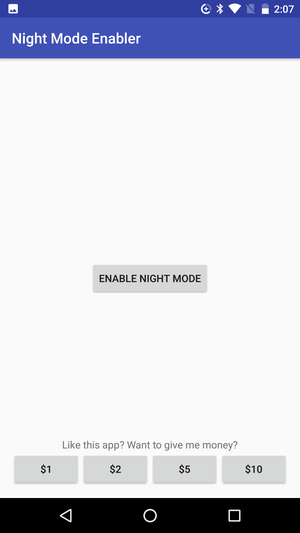
If you want to, you can activate night mode using the 'secret' section of the settings and a small third-party application.
Back to content >>>
'Easter egg'
Google hasn't forgotten about the traditional Easter egg, which can be found by tapping the OS version number several times in a row. Last time it was a simple minigame like Flappy Bird, this time – an explicit parody of Pokemon GO called Android Neko.
The essence is approximately as follows:
Back to content >>>
Outcome
To paraphrase Armstrong's famous phrase, Android Nougat was a small step for classic smartphones, but a big step for the entire OS as a whole. Some of the changes that have taken place in the OS will be appreciated primarily by active users and owners of devices with a large display diagonal, other innovations will come to the court of almost everyone. But the main thing is that Google has clearly shown that it is not going to mark time, but is ready to further develop its mobile OS. Somewhere looking for time-tested solutions from manufacturers, and somewhere experimenting and imposing their game on the market.
The company is unlikely to rush forward headlong, promising to create a universal OS in a couple of years, equally suitable for all devices existing in the world. But Nougat outlined the vector of development of the system better than any words, the Rubicon has already been passed by the search gagant, and now it only has to go forward. Perhaps, to a brighter future, and perhaps to a sad outcome.
I would like to believe that the word 'phablet' will come into use again, tablets will be resurrected once again, and compact phones will become even better and more convenient. Judging by Android Nougat, there really is some chance of such an outcome of the case, because the update turned out to be surprisingly pleasant. Even if not all innovations are designed to be used every day.
