Content
- Foreword
- Desktop
- Application menu
- Notification bar 'shutter'
- Lock screen
- Subjective impressions
Foreword
In the days of the first versions Android, when the OS interface looked more like an ugly duckling than a beautiful swan, branded skins were an important part of any smartphone. In the reviews, they were given no less attention than the design or performance of the device. Over time, the interface Android became noticeably prettier and became much more thoughtful and convenient. Then hard times came for developers of proprietary shells. Just making something bright, colorful and with a bunch of special effects was no longer enough. Any changes to the interface Android had to be done thoughtfully and carefully. On the one hand, it was necessary to improve the already good OS by adding a couple of bright and memorable touches to it. On the other hand, to keep all the main 'chips' and not violate its concept and corporate identity.
It would seem that sitting on two chairs is an impossible task. But some of them somehow succeed. Asus ZenUI is a prime example of this.
Immediately, I note that I really liked the shell. But in many ways this is a matter of taste, and what seems beautiful and convenient to me, someone else may not appreciate. This is completely normal, because how many people – so many opinions. It is for this reason that I will add more screenshots to the text – they will give you some idea of the shell Asus and help you at least roughly evaluate it.
Back to content >>>
Desktop
What do we get 'out of the box'?
ZenUI desktop is fully in line with all the new trends. Transparent status bar and dock bar, three familiar on-screen keys, 4×5 grid of icons. The main screen is a Google search widget and a minimalistic weather widget, made in light colors.
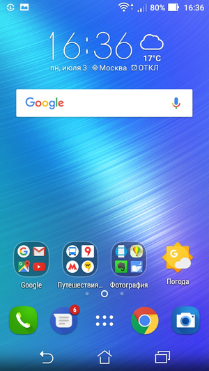
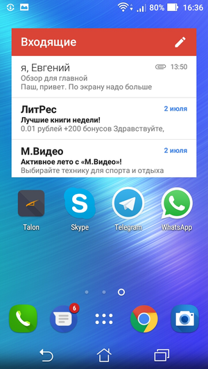
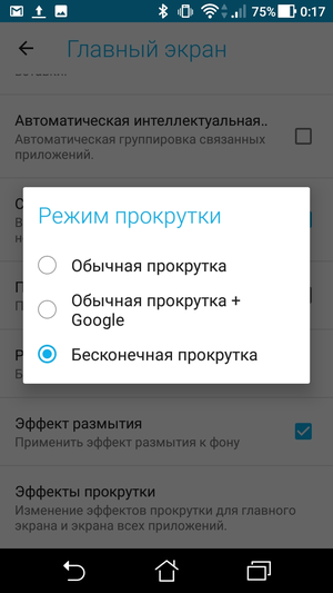
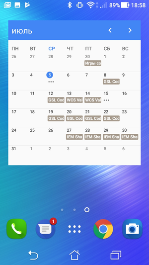
The first difference from the classic interface Android is the free choice of the home screen and circular scrolling of desktops, which for some reason really dislikes Google. If you, like me, use multiple desktops, this is extremely convenient. In the case of using three screens, each of them will be located at a distance of one swipe – the main one in the center, two on the sides. And even if you made a mistake and turned the screen in the wrong direction, nothing bad will happen. One repeated swipe – and you are there.
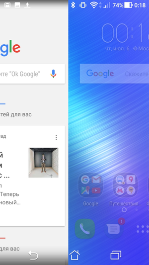
You can add a Google Now screen to your desktop screens. Useful if you have Now on Tap installed for a long press of the Home button.
I also really liked the way the folders looked. In 'clean' Android these are white rectangles of different sizes, which do not fit very well with the airy style of the OS. In ZenUI, each folder is a separate screen with a transparent background, which contains program shortcuts. But if you wish, you can choose a more familiar design.
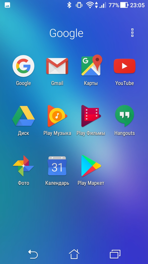
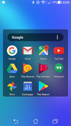
Compared to the standard Google version, the folder icon has become more informative. This is not a 'ladder' of icons superimposed on each other, but four miniature icons neatly spread in two rows. The final touch is that folder names can be selected automatically, depending on the type of content. So you can forget about the dominance of 'New folders' and 'New folders 2'.
Vertical swipe from top to bottom opens the universal search window. I have not found a practical application of this function for myself. You can disable it in the settings.
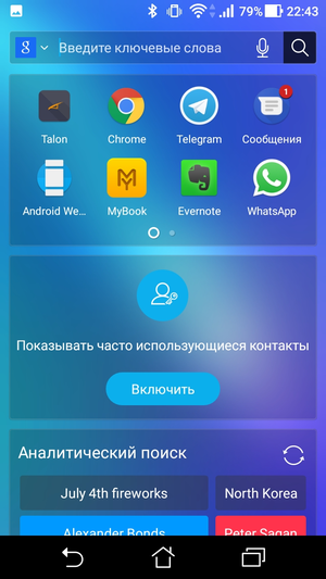
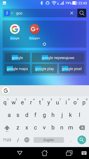
Every action, be it opening a folder, swiping the desktop, navigating to a menu or opening the notification shade, is accompanied by a light, unobtrusive animation. At least on Asus ZenFone 3 Max, everything works smoothly and without the slightest lags.
What can be changed?
You can change, if not everything, then a lot. It often happens that, supplying its shell with a bunch of settings and options, the manufacturer simply shifts its work onto the shoulders of users. And instead of making yourself a beautiful, convenient and balanced interface, it offers a cheap 'do it yourself' kit.
Fortunately, ZenUI is not the case. The out-of-the-box option is very good and will almost certainly suit the vast majority of users. At the same time, those whose eyes stubbornly cling to one or another element of the interface will be able to remake it to their taste. Considering that Google often introduces rather controversial changes in new versions Android, which are not to the liking of all old-timers, this is really great.
The main setup menu contains nine icons and is called by a long press on the desktop. Localization in this place pumped up a little – word hyphenations and inscriptions that do not fit completely spoil the impression of the shell. And it is not always possible to understand the meaning of what has been written. Looking at the inscription 'Lock on …' I was sure that we are talking about locking the desktop under some conditions. But in fact, the section is called 'Application Lock' and has absolutely nothing to do with the desktop.
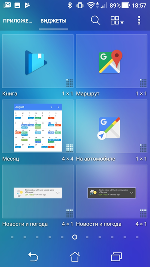
Apps and widgets. Go to the applications and widgets menu, made in the style of earlier versions Android. We'll talk more about it below. For now, just note that those who did not evaluate the vertical list of programs from Android 6.0 will like this design.
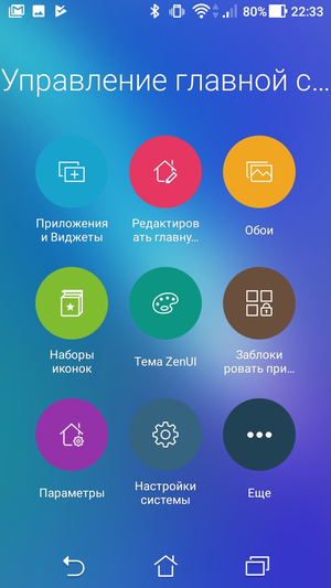
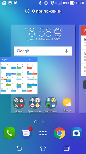
Edit the main page. Habitual desktop editing mode. You can go to it both through the general menu and by performing a 'pinch' on any screen. This is where most of the useful options are collected, such as resizing icons, choosing animation for scrolling screens, setting the type and size of fonts, and others.
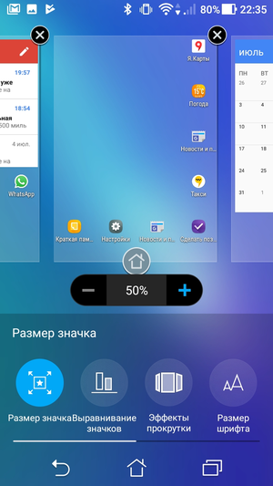
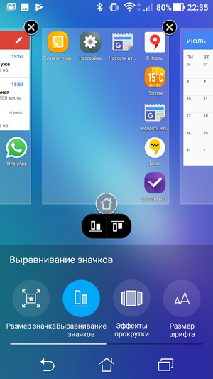
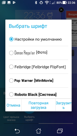
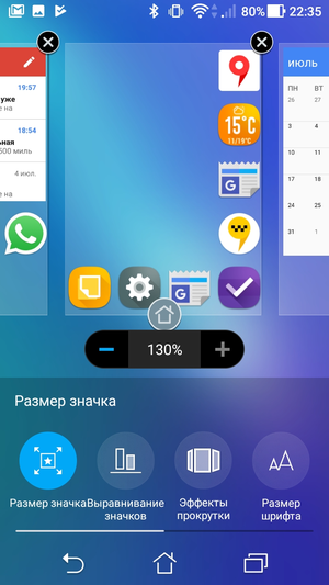
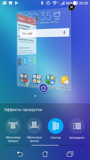
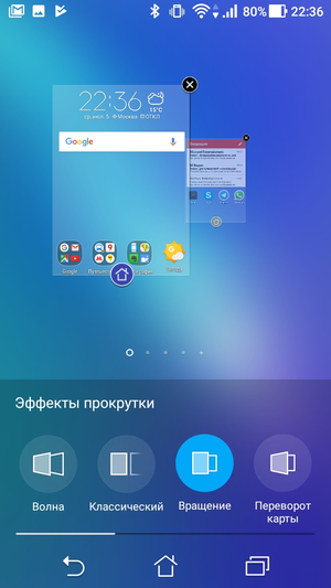
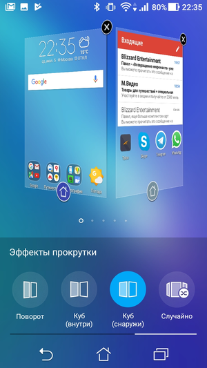
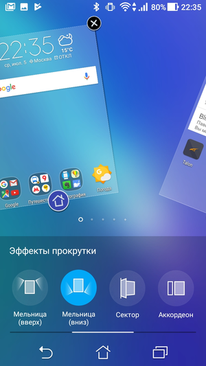
I emphasize once again that the design of working words is quite good in the 'out of the box' version, but you need to be realistic – you will never please everyone. Moreover, if we take into account different devices with different screen sizes. So the ability to customize the interface 'for yourself' is always a plus.
Wallpaper. At first glance, no surprises. You can choose a wallpaper (both classic and live) for both the desktop and the lock screen. From here you can go to the theme store, to which we will return separately.
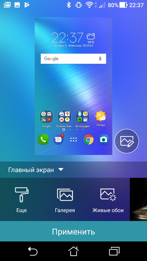
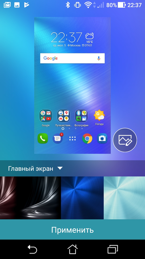
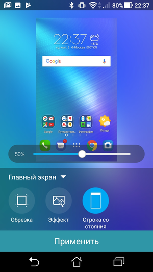
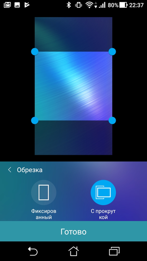
The main surprise is an icon located near the desktop, which opens an additional menu. From here, you can not only crop and adjust the type of background scrolling, but also apply a special filter to it. And also – adjust the transparency of the status bar.

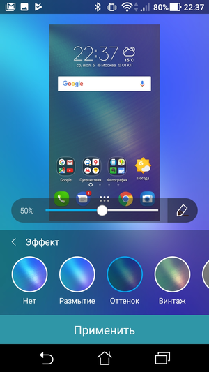
Icon sets. I never understood the point of changing the icon design, but many people like it. Asus ZenUI offers many different options to choose from that can be installed in just one click. So, if the standard set of icons did not suit you with something, this is the place for you.
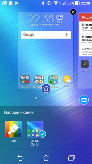

ZenUI theme. Store the themes that we will look at in the second part of the article.
Application blocking. The ability to set a separate password for the desired application. And this is exactly the feature that I have been missing on many phones. In 'pure' Android, this is still a problem, and in some applications setting a password is a special premium feature that must be purchased separately (and in especially neglected cases, you should also subscribe to it monthly).
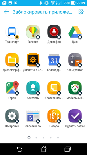
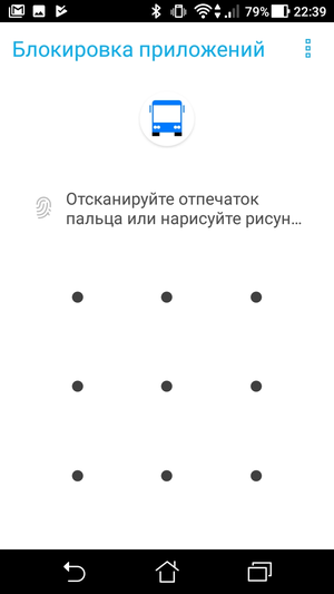
In my opinion, this is an extremely useful and convenient thing that should have appeared in the 'basic configuration' of the OS long ago.
Options. Complete list of all launcher settings.
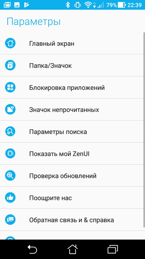
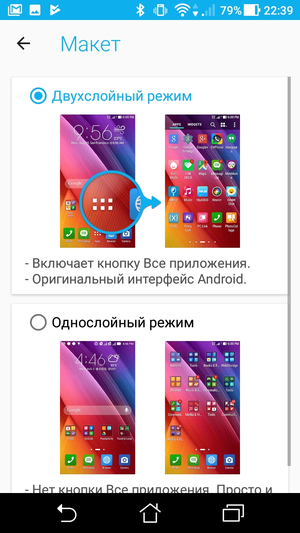
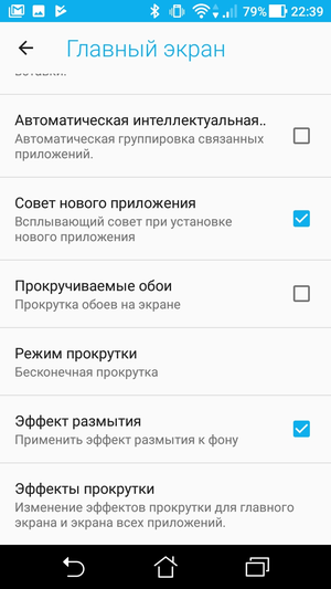
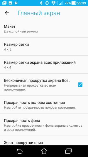
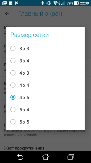
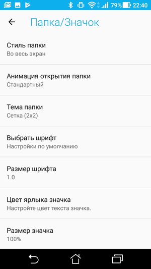
Here is a partial list of options:
- Choice of desktop layout (with application menu or style iOS)
- Screen grid selection (from 3×3 to 5×5)
- Menu background transparency settings
- Selecting an action on a horizontal swipe from top to bottom (quick search, opening the notification curtain)
- Detailed setting of folders (window design, animation, grid, font, etc.)
- Display unread messages next to the application icon
- Built-in search settings
System settings. Go to smartphone settings.
Additional options. App evaluation and feedback.
Back to content >>>
Application menu
What do we get 'out of the box'?
The redesigned application menu has become one of the most controversial innovations Android 6.0. It's been almost two years since Marshmallow was released, but many users still can't forgive Google. The application menu in ZenUI is a further development of ideas from past versions of the OS, and will be familiar and familiar to all 'old-timers'.
The menu is divided into two global tabs – 'Applications' and 'Widgets'. Nearby there are icons for search, settings and viewing mode selection. The scrolling mode is not vertical, but horizontal, which allows you to remember what is on which screen.
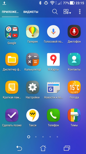
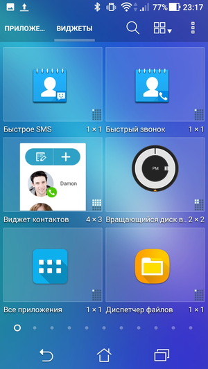
We have not forgotten about the support of folders. If you are too lazy to manually scatter applications into folders, you can use the smart grouping function. The smartphone will not only distribute applications in different folders, but will also choose names for them.
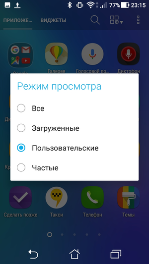
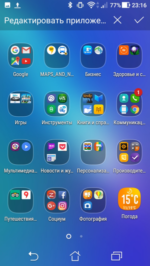
What can be changed?
First of all, you can freely swap items – another feature that Google has put under the knife. Secondly, choose a grid size, from 3×3 to 5×5. Well, and thirdly, you can hide unnecessary pre-installed applications.
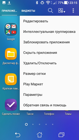
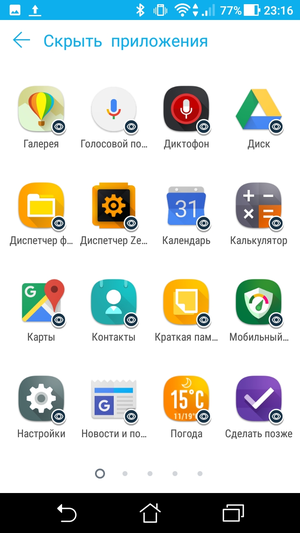
Back to content >>>
Notification bar 'shutter'
Working with notifications depends not so much on the version Asus of ZenUI, but on the version of itself Android. As you remember, it was the redesigned notification system that became one of the main 'chips' Android 7.0.


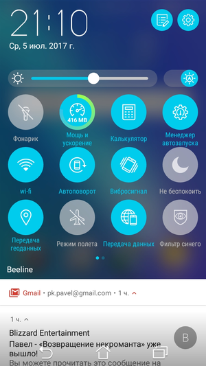
ZenUI has its own screen with quick switches. Initially, only one row of icons is displayed above the notification cards, but if you pull the shutter down, the quick switches window will open to full screen. The substrate imitates dark glass – a darkened and slightly blurred image of the previous screen is visible under it.
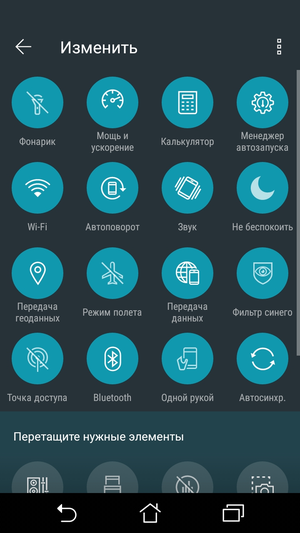
The main part of the window is occupied by the icons themselves, their set can be changed to your taste. If all the icons do not fit on one screen, you can always use the second one (switching between them is done with a horizontal swipe).
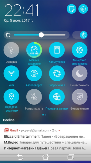
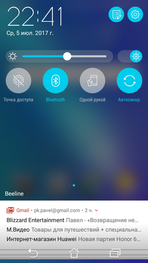
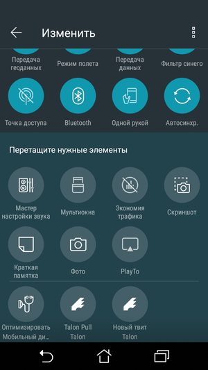
The clock is in the upper left corner, and the settings icons are to the right. Below the clock is a brightness level slider and a button to enable its automatic adjustment.
Back to content >>>
Lock screen
What do we get 'out of the box'?
Back in the days of Android 2.x, manufacturers realized how important a convenient and functional lock screen is. Every day, the user encounters him dozens, and sometimes hundreds of times. Because of which, any second delay is insanely annoying and turns into a bunch of wasted time.
I'm not ready to say which of the manufacturers was the first to come up with adding quick launch icons to the lock screen. It seems to me that the palm belongs to HTC, but I could easily be wrong. And this is not so important, because soon this idea was picked up by almost everyone … except for Google itself. What the search giant has against such icons has remained a mystery to me, but in 'classic' Android, you can only launch the camera and Google Now from the lock screen.
In ZenUI, in addition to the camera icon, which is located in the lower right corner of the screen, there are three more shortcuts: phone, SMS and browser. Additional icons allow not only to quickly launch the required application, but also to see how many new SMS messages and missed calls you have. In my opinion, it is very convenient.
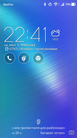
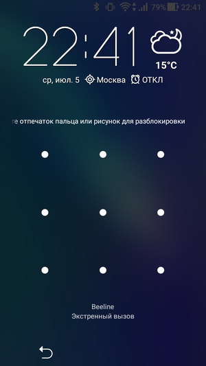
Confused only by the location of the icons. For some reason, they were placed closer to the left edge of the screen, and not aligned to the center. Perhaps this is a matter of habit, but this asymmetry hurts my eyes a little. On the other hand, the weather widget that occupies the top of the screen is also aligned to the left. Which smoothes the overall impression a little.
One of the interesting features of the ZenUI lock screen is weather animation. The idea itself is probably borrowed from earlier versions of HTC Sense, but the set of effects itself is completely different. No riot of colors and special effects – just light, unobtrusive animation.
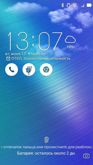
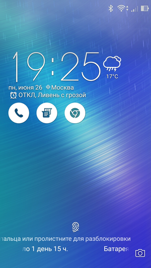
Among other 'chips' it is worth noting the Always-on Panel mode, which is an analogue of the acclaimed Always on Display from Samsung. The clock and notifications can be displayed even when the screen is off, which makes sense only if your smartphone has a AMOLED display.
What can be changed?
First, set up the blocking method: a simple swipe, pattern, PIN or password. Secondly, change the theme by finding a suitable option in the theme store. Or just change the background image if you don't want to deal with themes.
Among the less obvious things is customizing quick access icons. The only pity is that their maximum number in any case will remain unchanged – three pieces. Not that I need more, but it tends to 'finish' the entire line to the end.
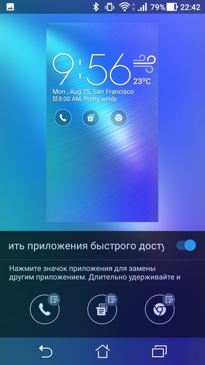
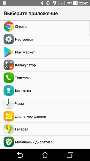
Proponents of minimalism can remove the clock widget from the lock screen, and avid photographers can set up a quick launch of the camera by double-clicking on the volume rocker.
Back to content >>>
Subjective impressions
Since the release of Android 4.0, I have preferred either 'clean' Android or a complete overhaul, like MIUI. Attempts to improve the classic interface Android were more like tea with six tablespoons of sugar. On the one hand, it seems to be pleasant that the manufacturer does not mind anything for its users. On the other hand, this does not make tea tastier. And when I have a choice, I try to do without that extra sugar.
Asus ZenUI is one of the few 'classic' skins that I was completely satisfied with both aesthetically and practically. This is not a mythical ideal and a super-innovative solution. And there are almost no unique 'chips' in it, all this has already happened somewhere and once. But working with Asus ZenUI was really comfortable for me. And in my opinion, this is much more important than a hundred tortured 'innovations'.
Post Scriptum. In the second part of the article, we will talk about the theme store, system applications, branded 'chips' and other interesting things.
