Switching to a new smartphone model within one product line shouldn't be as difficult as buying a device from another manufacturer.

We use Android, but we have a choice of many different software versions and builds on top of the main system of modifications from manufacturers. Be that as it may, the latter for a very long time cannot decide on the final version of their design, and the next round of this process was launched with the release of smartphones LG G6 and Galaxy S8, the interface of which has once again undergone significant changes. Yes, even Google has plans to once again change the design of the settings menu in Android O. If you are already accustomed to the good old interface of your device, then the need to adapt to the new look and user experience when switching to a new smartphone from the same manufacturer can be a challenge.
LG
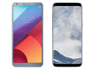
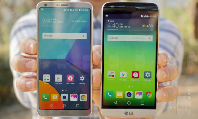
Both Touchwiz / Samsung Experience and LG UX have gone through many versions of the user interface over the years, with significant changes occurring with the release of almost every new device. After adding a dual window and an application LG SmartWorld in G4, in the next flagship (G5) the company decided to change the color scheme of the notification panel and switches for various parameters, as well as redraw the settings menu and customized the buttons in the recent applications overview menu . In the G6, the changes became even more obvious: the icons and the launcher itself were redrawn, numerous changes were made to the standard applications, and a long press of the Home button now launches Google Assistant.
Samsung
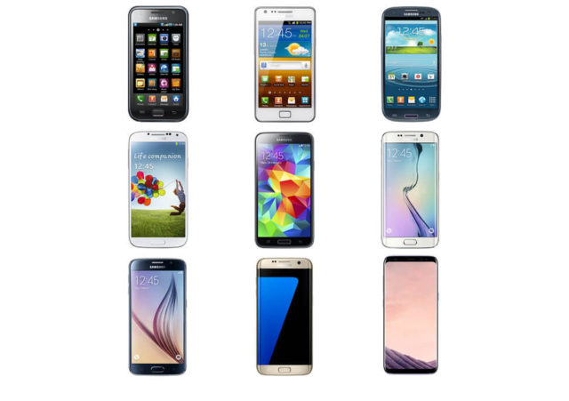
Similar changes have recently been made to Samsung. The Galaxy S7 introduces white-colored quick settings and notifications, new animation effects, and a rethinking of the settings menu, in which a number of options have been hidden under a new 'Advanced' tab. The interface also gained new ability to drag and drop multiple apps to the home screen, 'Always On' technology, Game Launcher game mode and other proprietary tools. And this is without taking into account the additional functions for flagships with Edge displays. But then GalaxyNote 7 appeared and crossed out all this even before the model was withdrawn from the market.
The Galaxy S8 now has a new layout for the soft navigation buttons and once again redesigned settings menu, a separate desktop for working with Bixby. So why are OEMs so zealous year after year to change some small interface elements, ignoring more obvious parameters, such as autonomy?
Is it time to stop?
The answer to the question is this: companies have not yet finalized the user interface design and are constantly improving their software in order to provide their users with the best user experience and gain an edge over competitors. LG has been under fire for years for its slow, overloaded interface and the rejection of the app menu in early versions of the G5 firmware.

For LG the G6 is an attempt to carve out the market share lost after the failed experiment with the G5. Therefore, it is more than obvious a step to update the UI in order to give users an experience that stands apart from the updated competitive solutions.
Of course, a reasonable question arises: 'why not switch to' stock '? The beloved default interface in Android offers a good balance between feature set and performance, even though it hasn't changed significantly over the years. The clear implication for companies is their belief that they can make an interface better than Google. There is always an incentive to increase the number of features and by adding options to the OS kernel and interface, to squeeze the most out of the unique technologies of the phone, such as the 18: 9 display in the LG G6. Nobody argues that there is a risk of overloading the interface with irrelevant functions. But at first glance, the G6 is well optimized in terms of performance and autonomy, so there are changes for the better.
Getting rid of a bad habit
For Samsung, much of the reason for the recent change lies in its own motivation. Recent flagship launches are still overshadowed by the Note 7 debacle, and the company is determined to convince potential consumers that the S8 has nothing to do with past issues. The new design and large-scale redesign of the interface serve as proof that we have a completely different, new device.

Further more: the shift from physical buttons to soft buttons means the S8 is missing one of the key brand identifiers. A new distinctive feature is the appearance of the interface, which are only the icons of the navigation keys.
Samsung has long been the most stubborn manufacturer to resist the Google vision Android. Instead, the company preferred to carefully and meticulously create a unique look for its user interface and duplicate all kinds of Google applications.
For Samsung, a custom UI is just as important in building brand awareness as it is providing users with rich functionality.
It is difficult to blame manufacturers for the constant change of key elements of their software: the competitive environment in the market still forces them to offer more and more new features to successfully fight the competition. Still, a large stream of seemingly insignificant 'tweaks', explicit and implicit, can confuse users who need familiar key features when moving to a new device. Switching to a new model within one product line shouldn't be as difficult as buying a device from another manufacturer. Variety is good, but not when change is being started just to make it happen.
Original material by Robert Triggs
To some extent LG and Samsung found themselves in similar conditions: the flagships of the last model year did not meet the investment and expectations, this year it is more important for these manufacturers to prove to everyone that they are still capable of producing decent devices, that and it happened.
As for the dynamics of the interface change, the question raised by the author will be relevant only in markets where the majority of users change smartphones every year. Suppose I, as a user of the fourth generation Galaxy Note, are not at all against the new interface in the upcoming Note 8, there is a noticeable time and technological gap between the devices, which in itself implies visual changes. What stops me is, perhaps, the 6.3 ″ diagonal at 18.5: 9 and the resulting form factor a la S8 +. Well, it does not fit in my understanding with Note, it takes time.
So for markets where the product cycle of devices is two or three years, the problematic is devoid of its sharpness. Otherwise, I only support the work of different manufacturers on the interface, monotony is not about Android.
