Regardless of your attitude towards the holes at the top of your smartphone display, this design compromise brings us closer to the ideal smartphone …

Original material by Quentin Kennemer
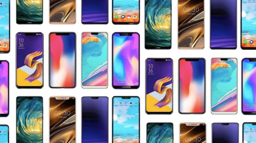
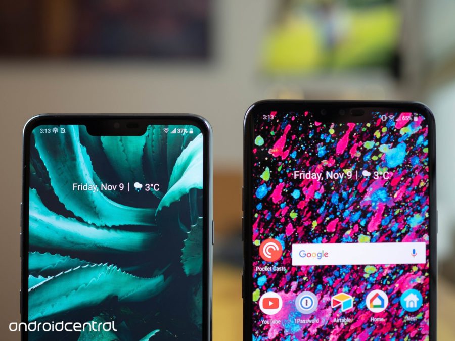
In the world of smartphones, there is no more rapid breakthrough than the pervasive shift to the ill-fated notch at the top of the display. Despite the negative reviews about it, today the cutout is one of the characteristic design finds that can be found in our favorite gadgets.
It is easy to cite iPhone X as the reason for this spread of the 'monobrow' (although the smartphone was not a pioneer here, it was ahead of a competitor from Essential). After all, many manufacturers saw Apple as a trendsetter, because anything that Apple does usually 'works' against all odds. But I don't think the reason is that Apple went to 'cutout'. The fact is that many smartphone users like the cutout more than they themselves think.

This will go against many opinions, but read to the end. You don't like the neckline by itself. I love it because of the way it changes the rest of the user experience. Many are reluctant to note that such a design adds useful screen real estate, and they are ready to make such sacrifices. But these same users in the same sentence say that the insignificant gain is not worth the grotesqueness that the 'cutout' entails.
Thanks to the notch, we realized that users actually like more elongated displays that take up the entire surface of the phone horizontally. We learned about the importance of more powerful cameras and more convenient options to keep our information private. And, just as important, we learned that many do not want to have anything to do with this sad black stripe (or dot).
Do not immediately re-evaluate the 'notch' in the display of your smartphone, because this step brings us closer to the coveted ideal smartphone. Polar opinions about this trend are important from all sides. Companies have developed a clearer understanding of the future vector of their research and development, which will be reflected in the emergence of potentially better smartphones.

We have already seen technological advances in components that will herald this future. Ultrasonic fingerprint sensors will allow companies to add the most popular biometric authentication method to smartphones by placing it in the most natural place without the need to reduce screen real estate. And if they succeed, they can make their biggest dream come true and hide under the display and sensors, thereby forever saving us from 'cutouts', 'holes' and other weird display designs.
History has a tendency to repeat itself, and there is no need to look far back. The fingerprint sensor in Motorola Atrix was terrible, but look how much better it is now. We considered all-glass smartphones to be goofy until a lot of attention was paid to wireless charging and signal quality. Additional creeping displays on paper looked promising, but after several failed attempts, no one remembers them now. I will never forgive Kyocera for the Echo, but at least I give them credit for trying to do something new with two displays. And what do you think? The Kyocera were actually not far from the truth.
The future is not quite here yet. Device manufacturers take time for technology to mature, and even longer for it to become commercially viable. From time to time, a smartphone appears, trying to bring back outdated ideas in a modern format.
Some companies don't even try these ideas in advance on existing devices, and such concepts become an effective finishing touch in the context of boring new product launches. In the end, they are trying to figure out if anyone needs the released devices, before spending millions and billions on design and development.

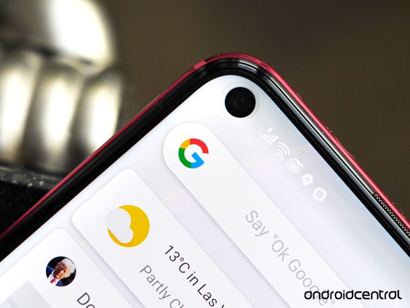
These constant attempts to reinvent the wheel are key, as sometimes the technology of a particular era does not match the scope of the vision. It's a game of balance and compromise, which is why the Samsung Galaxy S10 will feature a 'dot' notch display that will once again kick-start the conversation and debate about modern smartphone design.
I just wish we could all remember how and why innovation works and why we have to suffer through these periods of questionable design decisions. No self-respecting consumer electronics manufacturer in the world wants to scare away buyers, so instead of swearing at them, let's better understand why they do this. Sometimes their actions are meaningless (well, really, what did the headphone jack do to you?), But let's not recklessly curse their names without considering the realities of the modern market and the desires of consumers who are moving them.
Original material by Quentin Kennemer
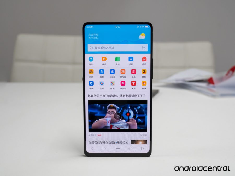
Frankly, I never liked experimenting with holes in the display. Apparently, this is partly why I still have not bought myself a new smartphone, although the old one works like a new one, albeit a little cluttered with files and software. But literally for a few days, to my great regret, it was time to part with Vivo Nex Dual Display, the smartphone was staying with me for a week as an object of testing. And my emotions regarding the lack of a cutout (as well as a front camera) above the main display of the device correlated very well with the thought of the author of this material. If cutouts of all stripes prepare smartphones and us for the future that the smartphone from Vivo demonstrated, then I'm ready to soften my discontent. But at the same time, I am not the owner of a device with a similar design, since several such gadgets have been tested, which helped to establish my opinion.
Of course, the subjective aspect is strong here, and all these models a la iPhone X will not disappear from the market in an instant, but there are alternatives, they are already on sale and soon this whole story with 'monobrows', I hope it starts to fade away. Otherwise, this intermediate stage, in my opinion, was too long.
