Based on materials from androidcentral.com
'Too colorful settings!'
“How dare they add support for the unibrow!”
'Time was placed on the left? Really?!!'
If you look at the discussions of the developer version Android P, you will definitely come across similar statements in the comments. A number of changes that were discovered in the first version made many users Android tremble with fear and anger. But calm, only calm! While some of the design changes are controversial, overall there is nothing to worry about.
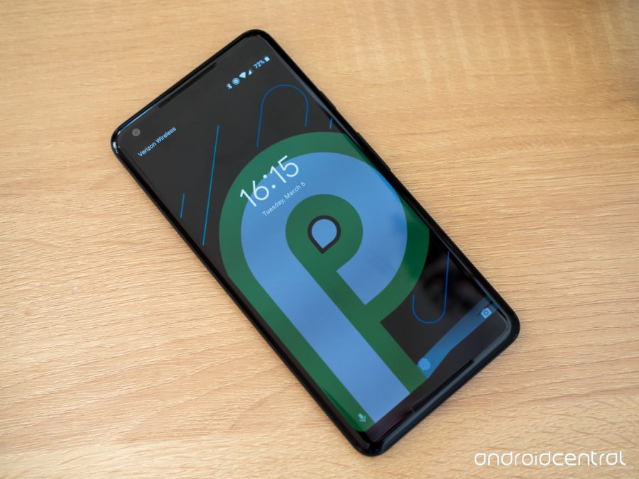
Google will release three more developer versions before Android P goes public. This means that a lot of what we see now can be changed and polished up until the day of launch. This material is just a first impression of Android P.
[iframe url = '// www.youtube.com/embed/pzhewntzNs8 ″]
New user interface
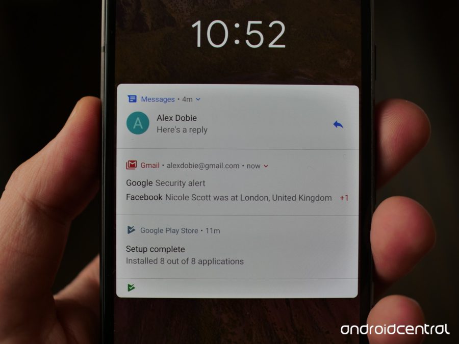
Android looks very similar to Oreo, but there are a couple of key differences that set the chairs on fire under users: the quick settings panel and the settings screen.
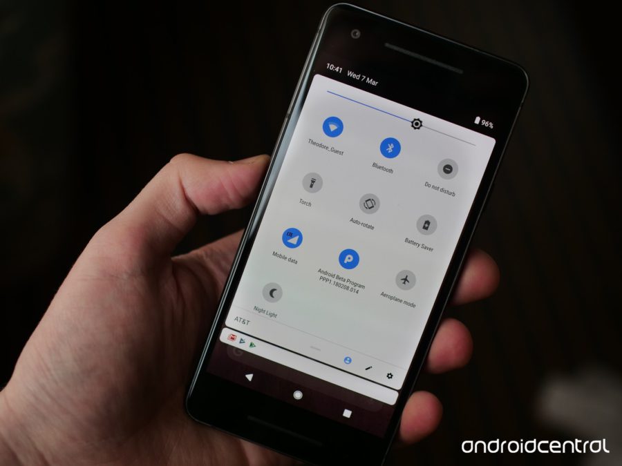
In Android P, the quick tweaks have a rounded and more colorful design, with round icons and a blue highlight color, as opposed to the white and gray elements we see in Oreo now. Someone may consider this decision cartoonish and kindergarten, but there is no reason for hatred here. The new look gives Android more personality and works well with Material Design.
A similar solution applies to the settings screen. The search bar at the top has rounded corners, and the icons for each settings page have also become round, and each has its own color. All of this is very different from the monochrome Oreo – but, again, hardly a cause for outrage.
Much that can be seen in Android P demonstrates the further evolution of Material Design principles. The elements take on a smoother and rounder look, and where gray was previously used, there are color accents. The notification bar and home screen use a more card-based design. It looks like this is our first encounter with Material Design version 2.0. I can't wait to see what else he brings new.
Notifications Android: the best is not the enemy of the good
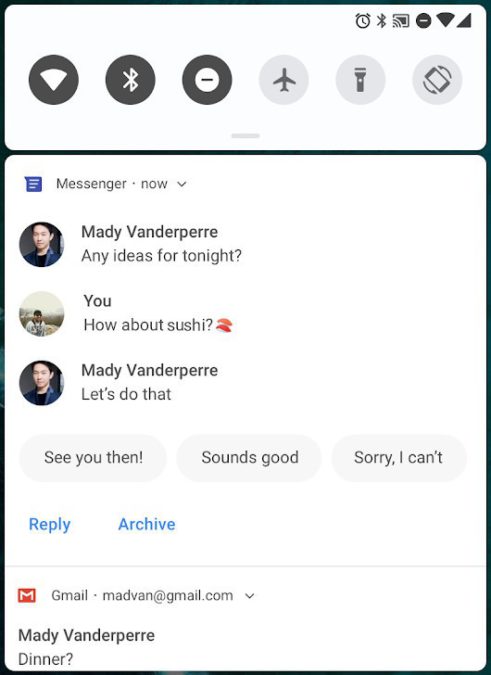
One of the most overlooked but critical features Android is its implementation of notifications. In this part Android is years ahead of iOS, and in Android P it will get even better.
Android P will allow apps to show full pictures / stickers in the notification bar, moreover, 'smart' / quick replies have been added. It looks a lot like Google's recently released Reply app, and getting that functionality already built into Android is great. For those who primarily use their phone for business purposes, notifications play an especially important role in their daily lives. In Android, it's enough to just clean up a bunch of piled notifications, and the new features in P that they promise us will make everything even more convenient.
Much remains behind the scenes
The features mentioned above, directly visible to the user, look very nice in themselves, but, as in Oreo in its time, there are many more ways left behind the scenes to take daily communication with a smartphone to a new level. There won't be a detailed list of changes here, but some are worth listing:
- Autocomplete will work with default web browsers;
- When editing text, moving the cursor will have a zoom effect to make it easier to see what you are doing;
- Do not disturb mode will be much easier. Instead of fiddling with three different profiles, you just turn it on and choose the notifications you want to hear;
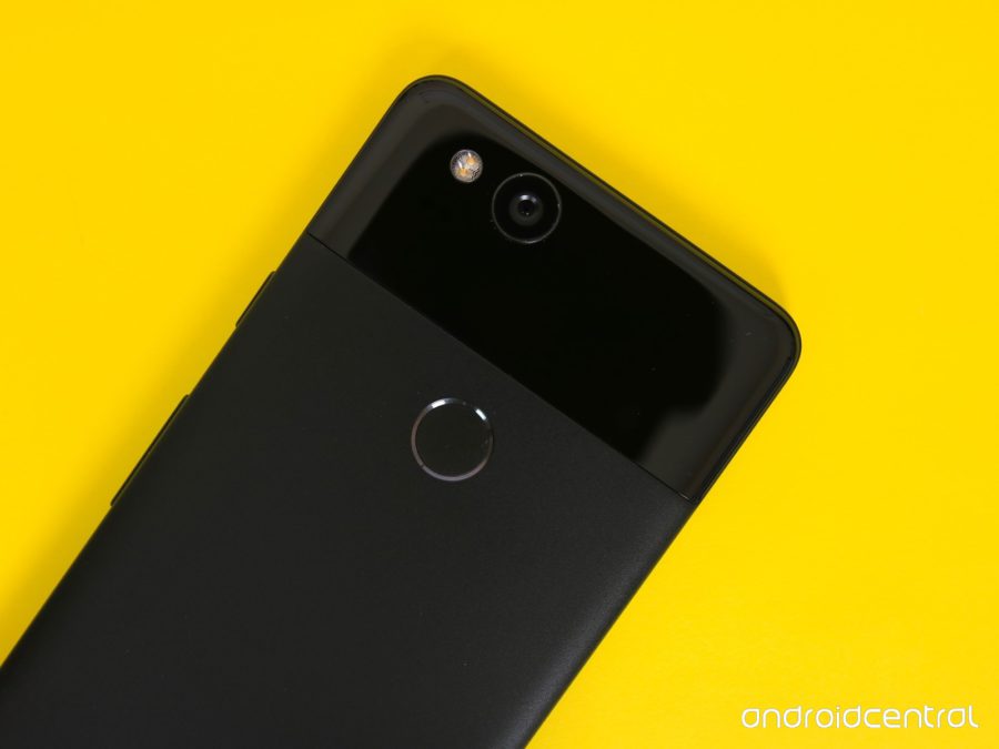
- On Pixel 2, Always-on-Display now shows the remaining battery power as a percentage at the bottom of the screen.
- New button for screenshots, appears when you hold down the shutdown button and has built-in editing tools;
- The microphone in the Google search bar in Pixel Launcher must support Google Assistant.
More changes to the Pixel 3?
In addition to the changes and enhancements in subsequent developer releases, there is a good chance that Google has saved even more software for the Pixel 3 launch. Even after the Oreo release, the Pixel 2 was the first phone to feature a Google search bar under the app listing, adding the At A Glance, a dark theme based on the wallpaper you use, etc.
We will see all the main features and changes in Android P by the time of release in the third quarter of this year, but it is logical to assume that Google will have a couple of trumps up its sleeve to expose new devices in an even more favorable light. What do you think?
All the way
As stated earlier, the Android P that we were shown is the first version for developers, and it is not at all certain that the final version will be the same. The functions that we like will of course remain, but possible roughness may well be eliminated in the coming months. And even the current version looks very nice. It may take a while to get used to the new design, but in any case, it was time for Google to refresh the look of their brainchild.
Updating the look of the system, along with all the chips that will be added, gives us the right to expect one of the best releases Android. How do you look at it, dear readers? Are you waiting for a new 'robot'?