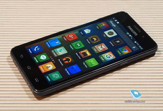
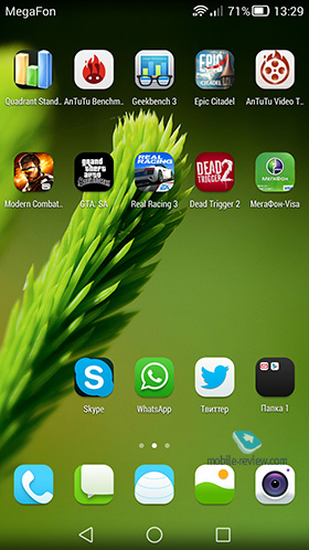
I unpack a new smartphone, do the initial setup and get to the main screen. Instead of the usual icons, I see their image in terrible ugly squares and wonder why I should spoil the stock Android like that?

Do you know what the main geeks argument for the original Google Nexus is? It sounds like this: 'all problems are from the manufacturer'. Firmware lags, software crashes, localization curves and other bugs, most of which are the fault of the manufacturer, who changed the stock interface Android to its own, not always ideal, shell. I partially agree with the geeks, with the only addition that sometimes vendor additions are positive, not negative. Take the same dialer and keypad from HTC, which became reference in the days of Android 2.x.


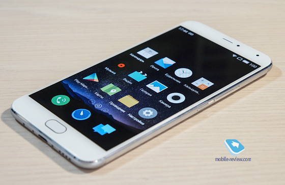
But today I would like to talk to you about a sore point. About the terrible ovals around icons used by many manufacturers, ranging from MIUI (although they changed the approach in recent versions) to skins from Huawei and ZTE. I perfectly understand where the roots grow from these 'ovals'. Of course, the Chinese spied the shape of the icons from iPhone from his iOS and maybe three years ago a similar design was relevant for someone. But now even the stock Android has excellent built-in icons and the same iOS is largely secondary, however, some Chinese manufacturers still continue to exploit the design iOS, while not always successful, or rather, almost always unsuccessful.

To be honest, I absolutely do not understand this approach, and it would be fine for companies to focus exclusively on the Chinese market, but no, many of them feel great on the global. In my opinion, such a design is a step back and gradually even Chinese companies are abandoning it in favor of separate themes (Meizu, Xiaomi, Lenovo).

