Recently, I have been frequently monitoring both app stores looking for something new and interesting and have noticed a big difference in their work and design. Let's talk about this in more detail.


Appearance and information content
Let's start with the look of the home page. See how much of everything fits on the screen iPhone. The first block is interchangeable; it contains various interesting collections of software and games.

The second line is for new applications, and the third for new games. You can easily look at the most relevant and interesting.


Scroll down and see four more different collections, as well as information on the App Store for newbies.

Below are a few more selections, this time of the Apple Design Awards winners.


Popular apps and games follow, followed by collections of different categories.

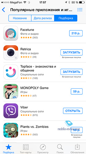
Then we have games and programs for children, offers by category and a special selection of 'Summer get-togethers'.
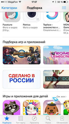
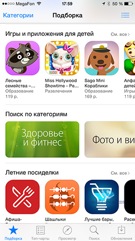

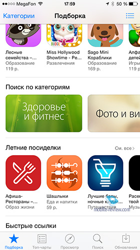
The main section ends with links to instructions and purchase explanations.

Now we open the Play Store. On the home page, a good half of the space is occupied by Google Play category buttons.

Below are 'News and Updates', while only the first three applications are available for the fastest viewing.
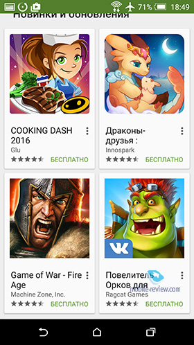
Below are recommendations from Google and new / new app updates.

They are followed by recommendations from friends and a section for fans Android.


The main page ends with sections of films, books and music, between which are inserted selections of software on topics.

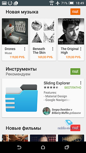


After a short acquaintance with both stores, I will explain why it was generally needed. Initially, I planned to periodically write reviews of new applications or games on Fridays and alternate them with a Friday column. The first issue was supposed to be today. But here's the problem, Play Store isn't optimized for that at all. If in the App Store on the main page I can find about 30-40 new and cool applications and games on the fly, then in the Play Store it is much more problematic to do this. There are some stupid quizzes and collections of recipes in the top, if we are talking about games, then solid freemium RPGs, etc. At the same time, I am not saying that there is no cool software and games for Android. They certainly exist, it's just that Google does almost nothing to promote them. As a result, it will be much easier for the end consumer who wants to download something new to do it on iOS than on Android.
What do you say, dear readers? Especially interesting are the reviews from the owners of devices on both operating systems.
