Based on materials from Android authority

Android got a new logo and a new naming system that ditched sweets in favor of dry soulless numbers. This is not to say that these changes are serious, but they affect those aspects Android that are associated with emotions. And therefore, they simply could not but cause controversy.
12 years after the appearance of the green mascot, it was not able to personify everything that is Android. The cute little robot is simply too humble for that.
Wrong droids
The green robot, informally nicknamed Bugdroid or Andy, was not intended as the logo for a major consumer brand. His role was to attract developers, personifying simplicity and accessibility, that is, personifying Android as a software product that anyone can take and start working with right now.
The creator of the first green robot, Irina Blok, sketched its outlines in just five minutes. And he seemed to be saying: look, there are no claims to complexity. Block says: “There were two designers who worked on this, but in the end my sketch was chosen. In fact, this is only the first drawing that came out in five minutes. Then we thought for weeks and painted again. I think that the simplicity of this sign really became a kind of statement, it's like a sign at the airport – a man, a woman, a robot. '
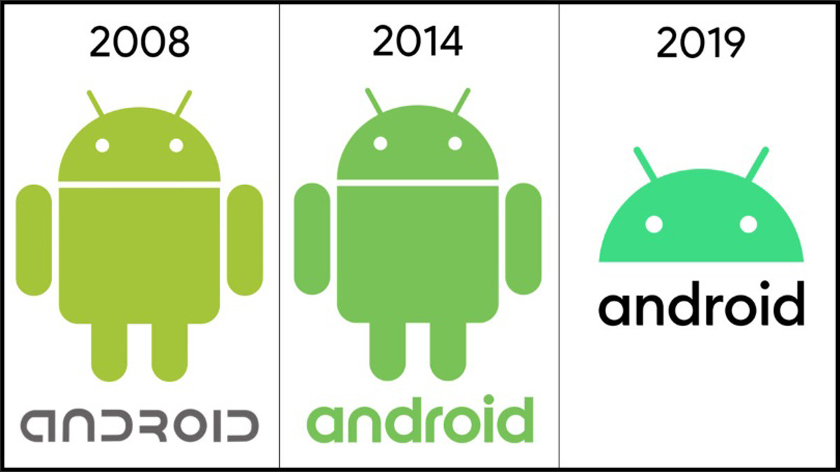
The first robot was a cheap and cheerful lime green (code A4C639) and had nothing to do with the glamor of iPhones of the 2007 era. The aesthetics of cheapness were intentional – Google needed to convince phone developers and makers that Android was great value that came for free. The biggest goal Android at the time was to spread quickly. And it worked great.

Android grows, the robot shrinks …
It worked for customers too. The humble green robot has unexpectedly become a favorite of the public. Google made its design publicly available, and people, like companies, all over the world started using it – even in a theme park in North Korea – and this allowed the robot to become literally ubiquitous and even cheaper.
The logo Android underwent minor changes in 2014. The robot itself remained almost the same, only the shade of green changed. We also changed the font in the spelling of the word that represents the second logo Android – they abandoned the geeky futuristic spelling in favor of greater relevance.
In the same year, Google began requiring phone manufacturers to use Powered by Android on the device boot screen. In this case, only the word itself was used, not the robot icon.
Material Design also emerged in 2014, bringing with it much needed unity across multiple Google apps and the app ecosystem Android as a whole.
Disembodied but inclusive
The current update looks like the culmination of changes that began in 2014 with the introduction of material design principles. The robot was replaced with its head, the most expressive part of its original form.
Behind the new design is the now popular principle of inclusiveness, which has its roots in the very beginning, in 2007. The first robot was supposed to be inclusive – it had no gender, nationality, and, as Irina Blok explains, “there were no cultural references to other characters or meanings.” But Google decided they could make it even more versatile.
The new shade of green is closer to blue. Sidney Thomashaw, Google's brand manager Android, said that it is better perceived by people with vision problems. In addition, it blends better with other colors.
Other minor changes have been made to the position of the eyes and antennas to make the logo more expressive and balanced.
In addition, the new logo is much more cohesive. For the first time, the logo Android combines a symbol – a robot's head – and an inscription. Previously, they were used in parallel and looked somewhat scattered.
“Our most recognizable asset, the robot Android, has become an endless source of inspiration for us. We began to change our inscription, making it a bit thinner, more geometric and more modern. And we added a few rounded lines to the spelling, which repeat and echo the curvature of the robot itself, 'says Tomashow. There is a lot of attention to detail here that was not present in the original design.

Thoughtfulness is expensive
The logo update is a fitting metaphor for growth Android as a technology and as an ecosystem. Initially, it was only a base, and phone manufacturers needed to create their own skins to make up for what was missing. But all this has become the property of history. Recent versions Android are system enhancements. In 2019, key updates have focused on accessibility. The days of rapid growth and radical change are over.

New color scheme Android
Graphic designer Tayo Onabul commented on the design changes: 'Very legible and familiar typeface, vibrant and accessible colors and most distinctive mascot implementation Android – now Android has become a brand for a global audience.' Taio also noted that Google may have come to a brand renewal Android as a result of competition within its own ecosystem. “They are obviously striving to achieve the same level of seriousness and maturity as their other brands. In the same vein, Samsung's One UI has taken a smarter design approach. ' Indeed, this brand update acts as an attempt by Google to define its own vision Android, different from what the same Samsung or Huawei offer.
Like the current OS Android, the new logo Android is improved but remains true to its heritage. Ultimately, the robot stayed where it was, it just doesn't look cheap anymore, and that's in tune with the idea that even budget phones with Android should feel 'premium'.
Someone will say that Android is losing part of his soul, and he may be right. But Android has to evolve and at least some of the old brand spirit will continue to live on. And if that consoles you, the robot image is still available – no one bothers to use it as it was. The green robot can be expected to remain a community darling, no matter what is done with the brand.
The final question remains – are the changes a step towards a complete rejection of the robot image or the entire brand Android. Google is not shedding light on what will happen next, but it doesn't look all that fantastic. Speculation about abandoning Android has been surfacing for years, the latter arose in connection with the development of Fuchsia. Will the new Google OS one day replace the old Android? Who knows, but one thing is for sure: the usual green robot has long been time for a landfill. Will you miss?