The screens of our smartphones and computers are taking over the night …

Original material by Angela Lashbrook
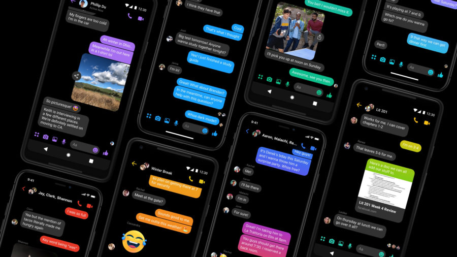
It's about night mode, a trendy feature among device manufacturers that replaces the standard vibrant color schemes with muted navy blue or black. The web version Twitter got this feature in 2017, and Facebook Messenger in April 2019. At the last WWDC Apple announced the inclusion of the corresponding mode in iOS 13, which will become available to users in the fall. Night mode will make “every element on the screen more gentle on the eyes,” according to company officials, and some users claim it is beneficial for migraine sufferers.
But so far there is no specific information that dark mode actually reduces eye strain for most users. Even for visually impaired users, the benefits of night mode are far from obvious compared to other long-available options. However, this aspect is hardly studied.
One thing is clear: in most daily scenarios, the night mode will not manifest itself in any way: it will not increase productivity and will not relieve eye fatigue. By and large, this is nothing more than another aesthetic tweak, not a game changer for content accessibility or productivity enhancement. In fact, dark color schemes degrade readability and performance for many users. A 2003 study looked at how different screen conditions, such as negative polarity (light text on a dark background) and positive polarity (black text on a white background), influenced users' understanding of an assignment. As a result, it was found that subjects performed tasks more easily when the screens were in the positive polarity mode.

In another study already in 2013, the authors studied the influence of these polarities on young and elderly subjects, because the deteriorated vision of an elderly person can theoretically determine how they are affected by screen brightness and contrast. It turned out that both groups performed best when the screens were in light mode. Although black text on a white background is technically the most effective solution for use on a screen, the apologists for night mode still have one reason: the function is very useful at night.
By analogy with looking at a burning light bulb in the dark or trying to see a dark corridor from a brightly lit room, if the phone screen is much brighter or darker than the environment, then it will not be easy for the eye to adjust. This experience is familiar to anyone who has ever tried to catch a glimpse of a phone at night or watched a TV show in dark colors in a well-lit room. This situation can lead to eye strain, and symptoms may include but are not limited to dryness, eye strain, and headache. In the long term, all this, of course, will not lead to serious consequences.
Many smartphones and computers now come with ambient light sensors that adjust the brightness of the screen in relation to the ambient light in the room you're in. But for those who are particularly sensitive to light or who simply don't like the warm tone of night mode Apple, these features can be a useful addition.
“Night mode can be extremely useful for people with sensitivity to brightness, because it reduces the overall brightness of the screen,” says Lauren Milne, assistant professor of computer science at McAlester College, her research on content accessibility issues. “Many people with poor eyesight, especially those with reduced vision, prefer white text on a dark background, which makes it easier for them to distinguish between words.” For many years, operating systems have had an option for color inversion, which made it possible to make dark colors light and vice versa, but as a result of activating such settings, an Andy Warhol-style effect appeared on the screen, which is not always welcomed or perceived positively from an aesthetic point of view.

But Syed Billa, a PhD in Information Science at Stony Brook University, believes night mode is not entirely effective for visually impaired users when compared to conventional color inversion. His research on technology accessibility for people with visual impairments suggests that people with various impairments, such as glaucoma, preferred larger text in high contrast modes. They have yellow, white, or green text on a black background. “This is quite different from Night Mode on Mac. It uses grayscale, borders and outlines are not too sharp and prominent, and it is difficult to use with non-Mac applications. ' So even though the dark mode in Twitter attracts people without visual impairment with its color scheme, it cannot fulfill the role of providing accessibility for people who actually need it.
Night mode is not harmful, it simply does not in any way facilitate the use of screens for people with visual impairments.
But it's worth remembering that there aren't many studies of modern 'dark' interfaces that talk about how they affect the readability of content by ordinary users. Apparently, well-executed such interfaces can improve the user experience of people with photophobia (sensitivity to light) or other visual impairments. But due to the lack of proper information on the topic, it is difficult to understand how much this will help or how best to apply the night mode.
“I would love to see more good research on the topic,” laments Silas Brown, a visually impaired computer scientist at the University of Cambridge. People with brain pathologies that affect visual processing (dyslexia, migraines, autism) may be sensitive to light and certain color combinations, but 'all these diseases are poorly understood and each of them is a kind of collective term for a number of smaller symptoms. therefore display settings will not be able to help everyone. '

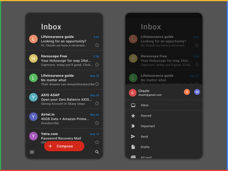
Gmail design concept
Still, Milne and Brown agree that having options is better than not, and for some users, Night Mode will bring a better experience to 'interact' with screens. “I'm always happy when a developer officially adds features like night mode,” says Brown. “This step allows users to know if there is a difference in this particular case or not.”
It's great that Apple and others offer this setting, although it doesn't necessarily have to be the best option for a brightly lit display. But we look at screens every day, often at night, and so we need more research on the most sensible ways to use screens. There are many gaps in the theoretical base now. This is especially true for people with visual impairments. Night mode is a welcome upgrade right now, but it could be something better in the long run if companies decide to prioritize accessibility settings like this.
Original material by Angela Lashbrook
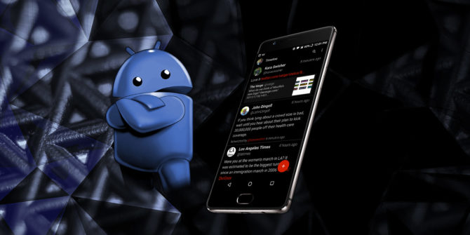
My unspoken 'struggle' with bright and dazzling interfaces has been going on since the days of endless flashing of the 'old man' HTC HD2 in search of the most ascetic dark theme that would look good in the overall aesthetics with a smartphone. And the transition to a smartphone from OnePlus put a big end to this search, from the first day it has a system dark theme installed on it. The social networks mentioned in the article, Google, YouTube, Gmail, Instapaper and other applications, followed her, but, interestingly, for some reason it did not grow together with WordPress and Telegram. Not to say that the reason for switching to 'night mode' is eye fatigue or visual impairment, for the most part – aesthetics and the prevailing belief about energy saving in a dark interface on AMOLED – displays. But I do not always perceive light systemic topics positively.
It is gratifying that more and more manufacturers are adding such options to the software of their devices, even Apple decided to catch up in order to keep up so hopelessly, better late. But at this stage, such an option is for the most part perceived as an optional element, although self-respecting developers try to include it in their applications, as mentioned in the article. I would like to hope that in the future the night mode will turn into something more conscious and massively useful.
