Android 6.0 Marshmallow: Evolution or Revolution? A detailed review of the new version of the Google mobile operating system: the logic of the interface, new functions, system settings, standard applications and more …

Content
- Interface
- Desktop
- Status bar, notification bar
- Application menu
- Lock screen
- Animation
- New features
- App permissions
- Volume control
- Do not disturb mode
- Google Now on Tap
- Text selection
- Direct Share
- Applications
- Dialer, address book
- Settings
- Wireless network
- Device
- Personal data
- System
- Hidden settings
- Outcome
Interface
For those who do not follow the development very closely Android, it may seem that since Android 1.5, there have been no special changes in its interface. After all, at first glance, all the main elements remained in their places: desktops with application shortcuts and widgets, dock bar icons at the bottom of the screen, status bar and notification bar 'curtain', application menu with a list of all installed programs.
In fact, there are a lot of changes in each version of the OS, they just don't always catch the eye. Android keeps up with the times and changes in the same way as the hardware component of smartphones and tablets. And it's not only about introducing new features or changing the graphic style of design, but also about constant adaptation to the current habits and needs of users.
In the early days Android, it was assumed that users would place shortcuts to all the applications they needed on their desktops. But they will not go to the applications menu much more often than to the 'Program Files' folder on a PC running Windows. It is no coincidence that there were as many as seven desktops by default (some skins even allowed creating several profiles with different icon layouts), but the application menu was represented by one long list, without the possibility of normal sorting.
The trouble is that the owners Android of smartphones themselves were not inspired by this idea. They really put the icons of the most frequently used applications on the desktop, but for all the others they usually climbed into the application menu. Accordingly, most of the desktops available in the system for the bulk of users were idle. So it’s not surprising that with each new version Android the original concept changed more and more, and by the time Android 6.0 there was practically nothing left of it.
Back to content >>>
Desktop
Initially, the system uses only one desktop, which contains several folders with Google branded applications and the standard Play Store icon. The first folder is reserved for basic services like Gmail, Google Photo or YouTube, the second contains shortcuts for notes and documents, the third folder is occupied by icons of sections of Google Play.
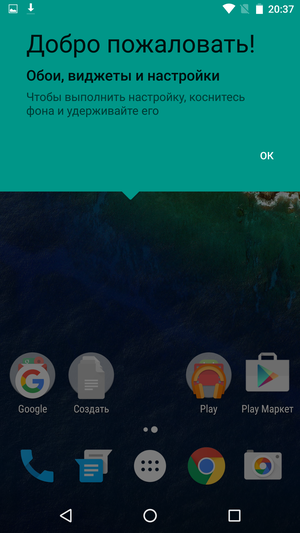
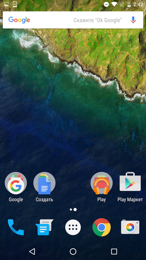
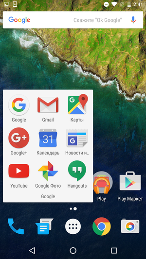
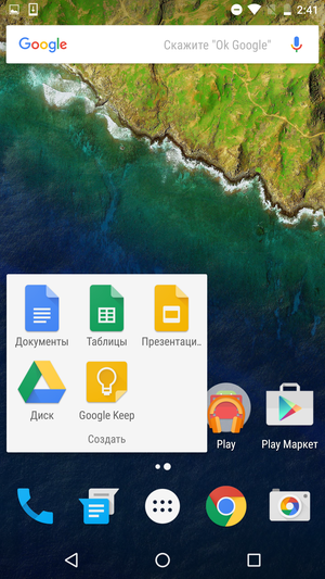
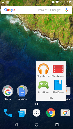
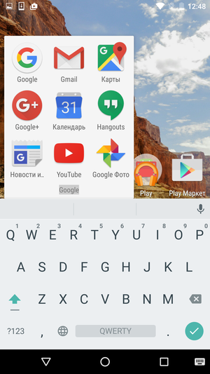
The appearance of the folders is shown in the screenshots above. The icon is designed in the form of a circle, on which the icons of the programs contained in the folder are located by a 'ladder'. When opened, the folder looks like a white rectangle with application icons, its name is displayed below, which can be edited at any time. You can change the order of icons in a folder, drag an existing shortcut to the desktop or add a new one to a folder by simply dragging and dropping. Creating a new folder is just as easy, just drag one application shortcut onto another.
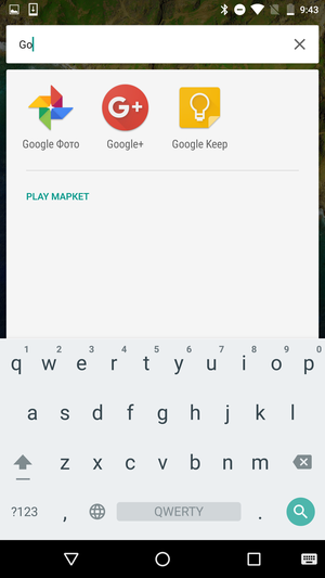
The area of the screen reserved for the icons of the dock bar looks no different from the desktop. All the same transparent background, all the same five icons snapped to a common grid and the usual support for folders. On the left side there are icons for the dialer and applications for sending SMS messages, on the right – the icons for Google Chrome and the camera. In the center is the application menu icon, which, unlike all the others, cannot be removed or moved. A short tap on it opens the application menu itself, a long tap brings up the built-in search window.
In general, there are surprisingly many types of different searches in new versions Android. For example, the Google search bar at the top of the screen. In fact, this is a regular search widget, only it is located outside the desktop area. So, firstly, it cannot be simply removed or moved, and secondly, it will be visible on any desktop, just like the dock bar icons.
Also, don't forget about Google Now, which has the left-most screen in Android 6.0. This was done for a reason, because a long tap or swipe on the Home button now brings up the Now on Tap contextual search window, rather than Google Now. Which is triggered including on the Google Now screen itself or on the Google.com web page. So, if you wish, you can assemble a kind of search matryoshka – search in search within search. And most likely, this is not the limit.
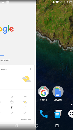

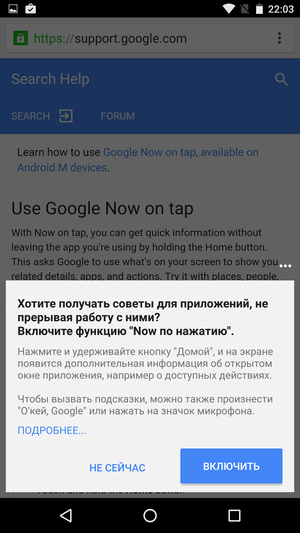
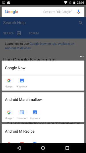
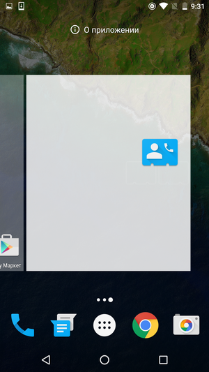
If you need to create a new desktop is very easy, just drag any existing shortcut to the edge of the screen, and then place it on the desktop that appears. You cannot leave empty desktops, they will be automatically deleted.
A long tap on any free space on the screen activates the desktop editing mode. Here you can change the wallpaper (both for pictures from a pre-installed set, and for any images available on your smartphone) and add one or more widgets.
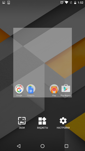
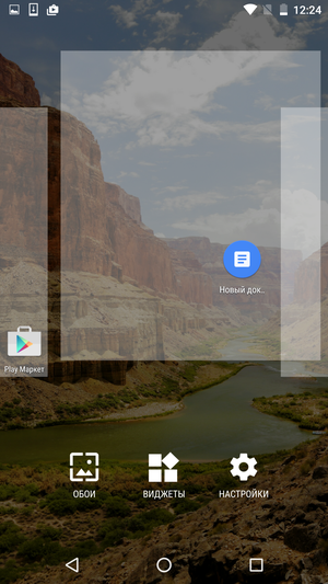
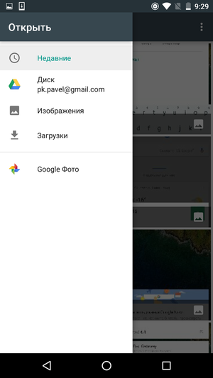
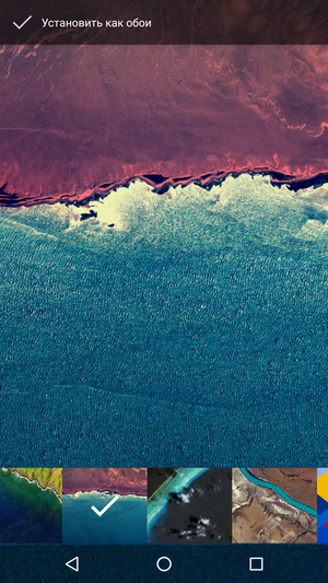
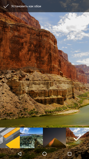
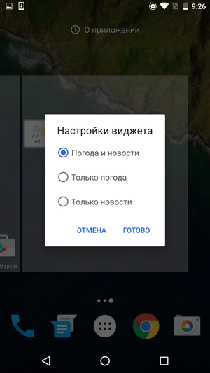
The list of widgets itself is designed as a vertical list, where each line corresponds to one application. But if the application has several available widgets and they all do not fit on one line, then the section with their thumbnails can be scrolled horizontally. Despite the fact that the size of the list turns out to be quite solid, it is surprisingly convenient to use it. Firstly, thanks to the names and icons of the applications, as well as alphabetical sorting, which allows you to quickly find the desired widget. And secondly, because of the large thumbnails of widgets, by which it is immediately clear what they are and how they will look on the desktop.
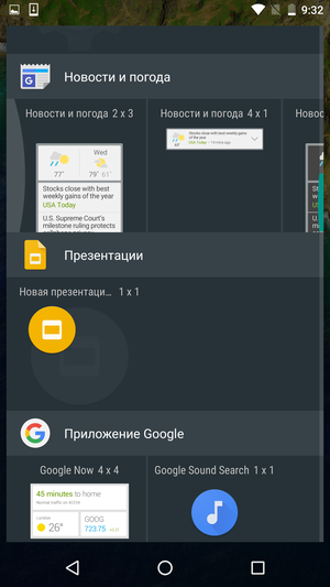
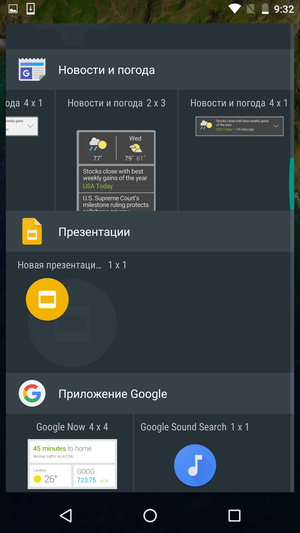
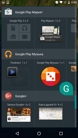
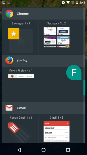
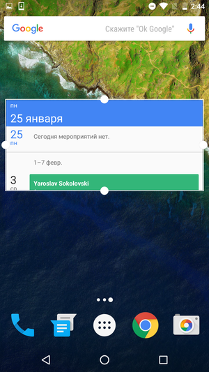
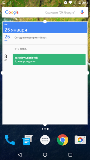
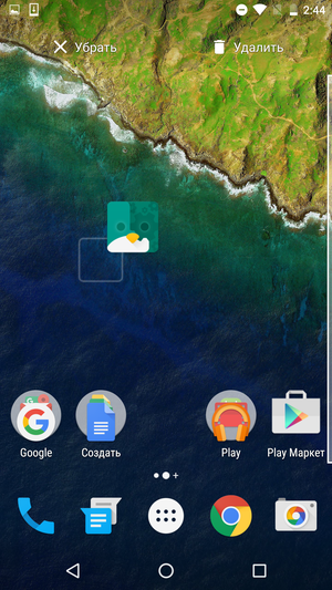
Many widgets can be resized – this is a standard feature Android that has been in the system for several years. To do this, just make a long tap on the widget installed on the desktop and pull on its edge. Removing a widget or app shortcut is even easier – you just need to drag it to the top of the screen, right on the 'Remove' message that appears there. Separately, I note that in a similar way, now you can delete not only the shortcut, but also the application itself. Unless, of course, it is considered systemic and was not preinstalled by the smartphone manufacturer itself. But before that, you had to either look for the program icon in the application menu, or go to the corresponding settings section.
Back to content >>>
Status bar, notification bar
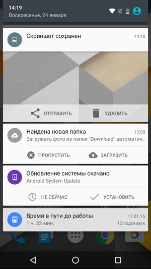
As before, the status bar is almost completely transparent. There is only a slight tint that allows the white icons to remain readable even on light-colored wallpapers. On the right side there is system information: time, battery charge, signal strength of the cellular network, Wi-Fi, and so on. On the left are application notification icons, such as messages about a new email, an available update on Google Play, or a saved screenshot.
You can open the curtain of the notification panel either with a vertical swipe from the top of the screen, or with a double tap on the status bar. In this mode, the status bar looks noticeably thicker, on its left side the time, date and day of the week are displayed, on the right – all other system icons and the user change icon.
All other notifications are displayed as a list of cards that can be swiped from the curtain with a horizontal swipe. In addition, under the list of cards there is a special button that allows you to delete all existing notifications 'in one click'.
The top card in the list is displayed in an expanded form – in addition to a brief description of the notification, some additional information (for example, a thumbnail of a screenshot taken or the text of an incoming message) and several buttons that allow you to perform basic actions without switching to the application itself can be displayed there. For example, turn on the power saving mode when the battery is low, reply to an incoming letter, download and install all available updates, and so on. Besides, any card can be opened or collapsed manually.
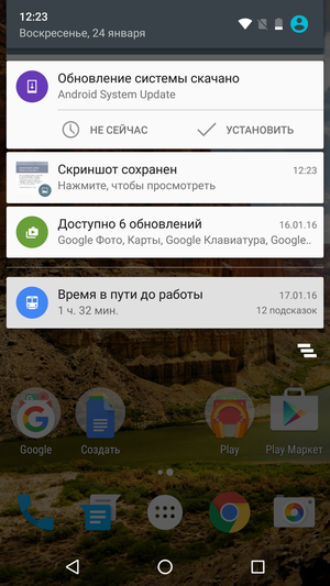
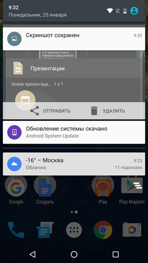
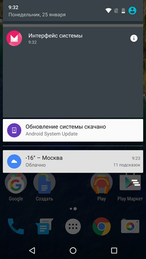
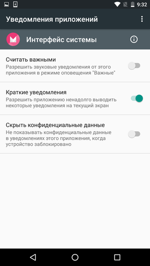
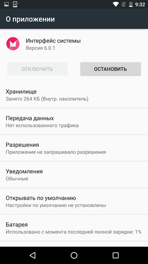
A long tap on the notification card shows which application it came from. By tapping on the 'i' icon, you can customize the receipt of notifications from this program in detail: block all notifications, mark them as important (thereby allowing sound signals even in the 'Do not disturb' mode), hide confidential data, and so on.
If you take another vertical swipe (or swipe from the top of the screen with not one, but two fingers from the start), the switch panel will open. This is the fastest way to turn Wi-Fi on or off, use a flashlight, put your phone in Do Not Disturb or Airplane mode, and so on. Just above the switch block is a slider for adjusting the brightness of the display.
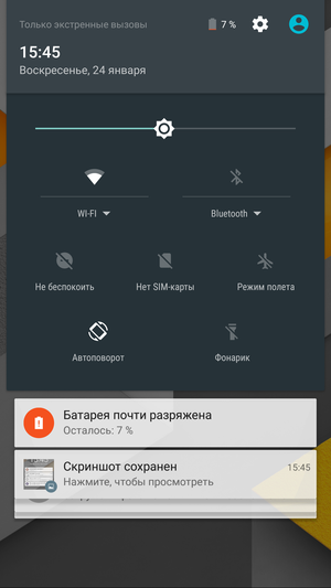
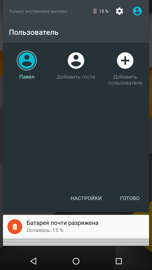
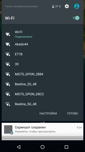
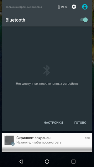
Sometimes there is a tiny white triangle icon next to the name of the switch. By clicking on it, you can select some additional parameters, for example, specify a Wi-Fi network to connect or see a list of devices connected via Bluetooth.
I do not really like how this moment is implemented in Android 6.0 – the name of the switch with the icon for additional options is very tiny, it is not always possible to hit it on the first try. Especially when shaking on public transport or on the go. In addition, instead of an incomprehensible triangle, it would be much wiser to use the familiar gear icon for everyone. Moreover, this very icon was chosen for the settings menu, which can be accessed from the same screen.
Initially, you cannot change the set or location of the switches, although in the current versions of the system there is one trick that still allows you to get to the desired settings. To do this, you need to press and not release the gear icon for a few seconds, which will activate the hidden functions of the system. We will discuss this in more detail in the corresponding section.
Back to content >>>
Application menu
In the new version Android, the applications menu has been significantly redesigned, which not everyone liked. Now it looks like a vertical list on a white background. All icons are arranged in alphabetical order (the letters of the Russian alphabet come first), you cannot manually change their order. The first line is occupied by the icons of the four most popular applications, a little higher is the search box.
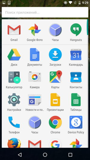
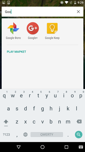
You can scroll through the list using a standard swipe or using a special slider on the right side of the screen. In the second case, the screen will show the letter of the alphabet to which you have scrolled through the list, and the icon of the first application starting with this letter will be slightly enlarged.
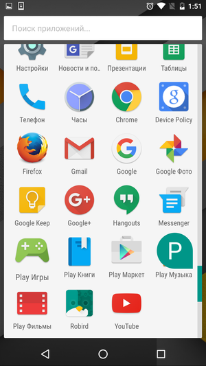
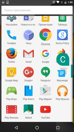
In general, the application menu has finally turned into a kind of analogue of the “Start” button from the desktop version Windows: a list of the most frequently used applications, a built-in search bar, sorting in alphabetical order, and so on. Someone will like it, some will not, but, as for me, it's just a matter of habit. Moreover, no one took away the ability to group and arrange application icons on the desktop from users in any way.
Back to content >>>
Lock screen
Compared to previous versions Android, the lock screen has not changed much. The font of the clock widget has slightly changed, although it is almost invisible to the eye. Now you can put some of your text under the clock, for example, some kind of reminder or a request to return a lost phone. And the set of quick access icons has also become a little different – the Google Now icon is now located in the lower left corner, and not the dialer, as it was before. However, you can always return the old arrangement of icons in the settings.
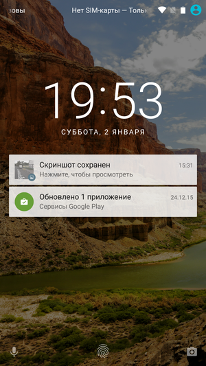

For a long time, calls were the main function of any smartphone, then they began to be content with the role of “first among equals”, and now it is already in question. In any case, from Google's point of view, quick access to the screen with personal Google Now prompts is more important than a couple of seconds saved on dialing a number.
In the right corner there is a camera icon, which can be turned on without entering a password, even if you have a PIN or pattern set to unlock your smartphone. Since the main part of the lock screen is reserved for notification cards, shortcut icons are huddled at the very bottom of the screen. Considering that 5.5 – 6 inches 'shovels' are in vogue right now, that's not great. Moreover, the swipe now needs to be performed precisely from the corner of the screen, and not from its edge.
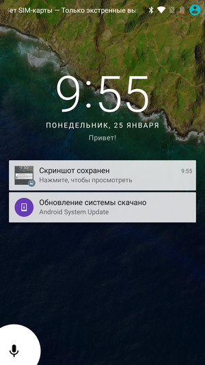
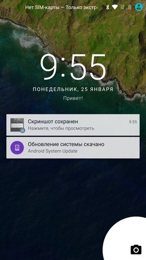
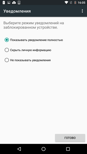
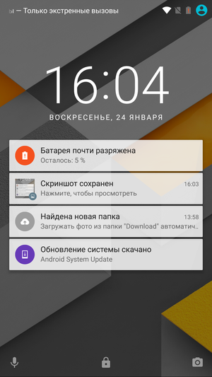
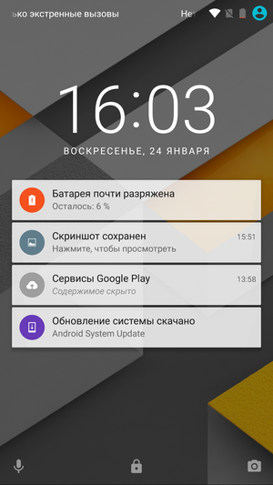
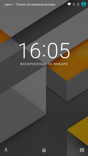
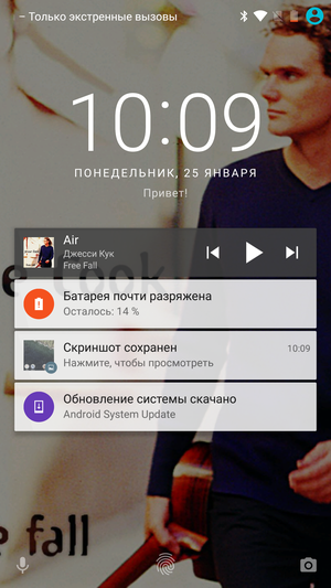
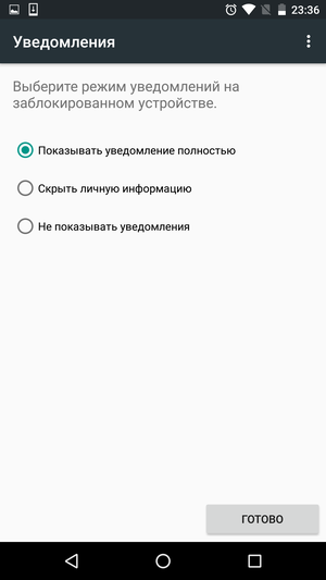
By the way, notifications on the lock screen may not be displayed, it depends on the security settings selected by the user. When setting up a password, you will be offered three options to choose from: display all notifications, hide confidential information, and show nothing. This is how the same notifications look with different privacy settings. In the first case, a thumbnail is visible on the card with a screenshot, and the name of the found folder with images is displayed in the Google Drive card. In the second case, there is no detailed information about these notifications, but the cards themselves are displayed on the lock screen. In the latter case, the lock screen is completely blank, it is impossible to find out about new notifications from it.
In some cases, additional information may be shown on the lock screen. For example, while listening to music in the Google Music application, a player card with playback control buttons will be displayed on the screen, and the wallpaper will be replaced with the cover of the currently sounding album.

Back to content >>>
Animation
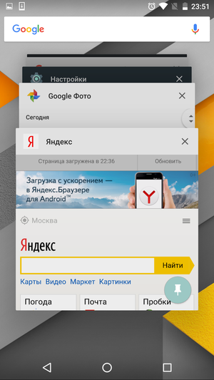
In the new version of the proprietary interface Android, the designers of Google have worked very seriously on the animation. For example, when you launch an application, it seems to unfold from its shortcut, and when you press the Home button, it floats down. The application cards in the task manager are animated in the same way – when you switch to the window of another program, its card smoothly opens to full screen. And even the application menu does not just appear out of thin air, but “grows” out of the icon located in the dock bar.
Someone will say that all these are mere trifles that do not in any way affect the operation of a smartphone. And formally it even turns out to be right. It's just such little things that give the impression of the OS, and it's good that Google finally got around to doing these very little things.
Back to content >>>
New features
The appearance of the interface is just the tip of the iceberg. Convenient organization of the workspace and beautiful design are important, but still, we expect from the new OS version not just a slightly different icon design or a new menu style. Especially when you consider that the vast majority Android smartphones are sold with branded shells from manufacturers, where the design will almost certainly be different. And in order to install the latest version of the Google Start launcher on your smartphone, you don't have to wait for the update to Android 6.0.
However, here you need to understand that the times of rapid development Android, when with each new version it acquired dozens of new functions and previously unavailable features, are long gone. And although this mobile OS continues to evolve, there are no global differences between Android 5.x and Android 6.0.
Back to content >>>
App permissions
The need to do something about the permissions for installed applications has been long overdue, and for a variety of reasons. First, few users actually looked through the long list of permissions required by the application to the end. And even more so, I thought about which of them and why this program is really required.
Second, an all-or-nothing policy, in which the user either allows the application to do whatever it wants, or completely refuses to use it, is generally not very convenient. Especially in the case of 'combine applications', which, in addition to the main function, have a couple of dozen secondary ones, for which they also need to allow something there.
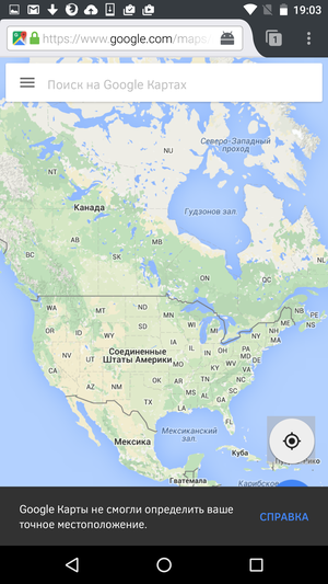
In Android 6.0, the permission policy has finally changed. Now, when installing an application, you need to give it only those permissions, without which it really cannot work normally. But decisions on all other points can be made already during its operation.
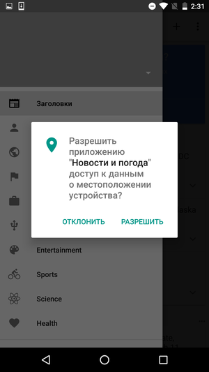
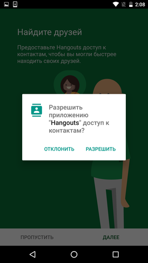
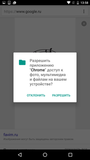
An example is the Google Chrome browser. To display web pages, he does not need access to the file storage of the phone at all, so initially he did not ask for it. But as soon as I decided to save the picture I needed to my smartphone, the system warned that it would not work without an additional set of permissions.
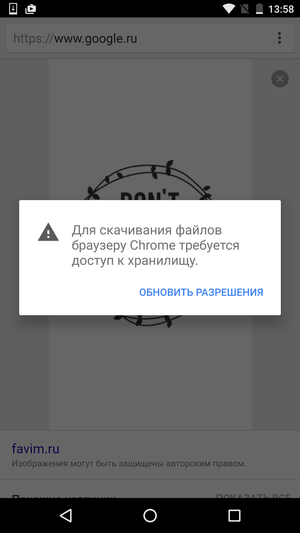
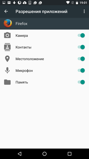
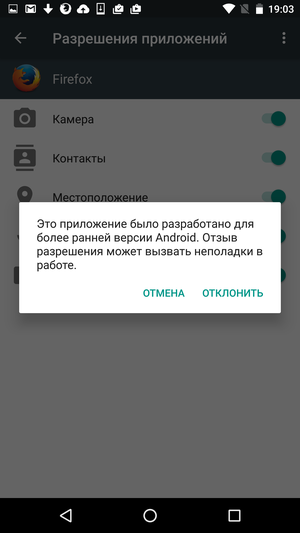
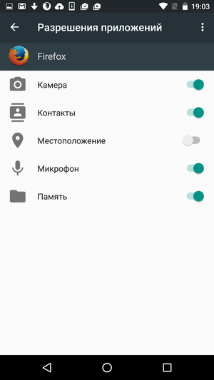
Of course, you need to understand that support for Android 6.0 for the new permission policy does not mean that it automatically appeared in all third-party applications. For example, the FireFox browser still works the old fashioned way and asks for all the necessary permissions in one go. Which, however, still does not prevent, after installation, to 'take away' the 'extra' permissions from it, but this time exclusively at your own peril and risk. How exactly after that the application will work, and whether it will be at all, no one will say in advance.
Back to content >>>
Volume control
This is one of the basic functions of any mobile OS, and, at first glance, there is nothing interesting in it and cannot be. In fact, its unsuccessful implementation can cause a lot of problems for the owner of the device, because one call that did not sound at the right time (or that didn’t sound on time, which is perhaps even worse), alarm clock or notification of a new chat message can sometimes be a disaster.
Rather than adjusting the volume of all sounds globally, Android divides them into three independent channels: ringtone volume, media volume, and alarm volume. When the user taps the volume rocker, it changes only for the channel of the current application. For example, when setting the alarm time, this will be the volume of its ringtone, while watching a movie – the volume of the media, and on the desktop or on the lock screen – the volume of the ringtone.
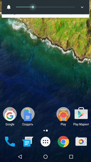
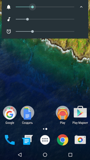
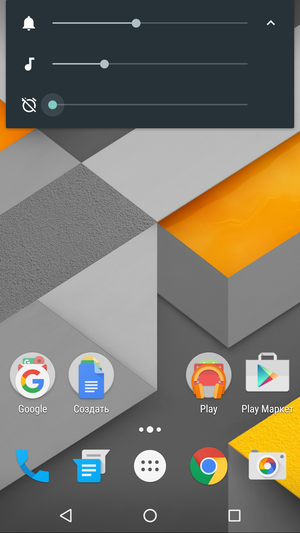

No one forces you to constantly switch between different applications to adjust the volume. The volume indicator that appears on the screen can be expanded downward and then manually set the values for each channel. For example, completely mute the sound in games, but at the same time to the maximum 'unscrew' the alarm clock or the volume of the call.
Back to content >>>
Do not disturb mode
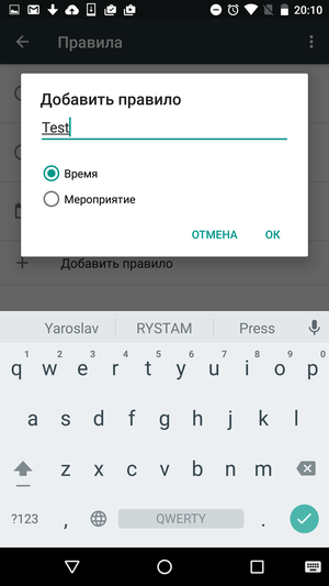
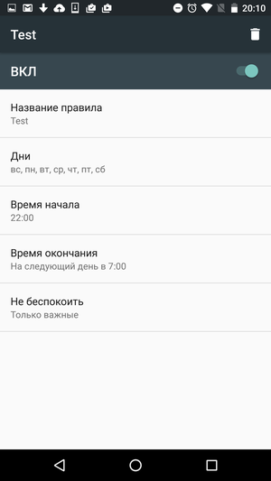
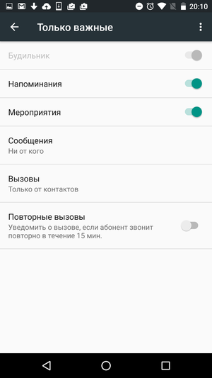
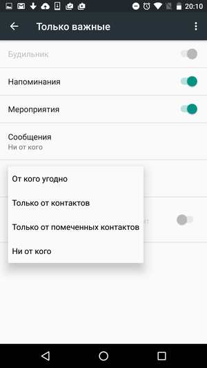
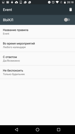
Another very nice feature that took a surprisingly long time to get to Android. This mode has three whole variations: 'Complete silence', 'Alarm only' and 'Important only'. In the first case, all notifications, both sound and vibration, will be disabled in the smartphone. In the second case, one alarm clock will work. The third option is the most interesting and allows you to customize in detail all types of notifications you need. For example, choose which contacts will be allowed to bother you at night, or specify whether to repeat the ringing tone if you just dropped the call from this subscriber.
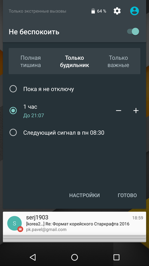
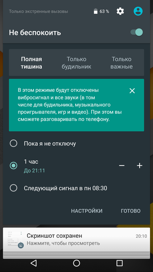
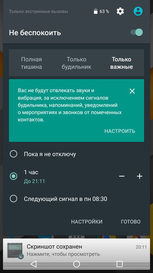

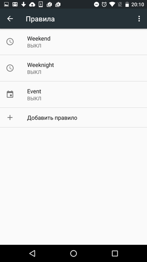
The situation is similar with enabling and disabling this mode. The easiest way is to either immediately set the time of its action, or choose to turn off automatically after the alarm goes off, or just turn it on and off manually. But if you wish, you can go to the 'fine-tuning' section and fine-tune everything to your taste. For example, a smartphone can automatically switch to Do Not Disturb mode for any meeting you schedule, or turn on only from 12 am to 7 am on weekdays.
Back to content >>>
Google Now on Tap
A new incarnation of Google Now, which now provides context-based hints. If you call it while reading a letter in which you make an appointment with a colleague, Now on Tap will prompt you to get directions to the meeting point. And at the same time, add an appropriate reminder to the calendar so that you don't forget about the scheduled meeting. If you're browsing a recipe with some tricky ingredients, Google Now on Tap will tell you what they are, what they look like, and where you can buy them.

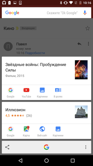
Within the framework of this review, I will not dwell on the work of Now on Tap in more detail, especially since the practical benefits of it are still far from obvious. And there is already a separate article on this topic.
 Now on Tap. Why, to whom and for what? Back to content >>>
Text selection
Despite the fact that the on-screen keyboard of Android itself is quite good, Google has not been able to achieve comfortable work with selecting and copying text for a long time. In any case, all this forced fuss with the cursor annoyed me personally.
In Android 6.0, the text selection mode was slightly changed. Now, when you slide the border of the selected text to the right, it will capture the entire word. But in the opposite direction (in case you needed to select only the first few letters), the cursor will move character by character, as before. In addition, the strange 'Copy' and 'Paste' icons have finally been replaced with normal text.
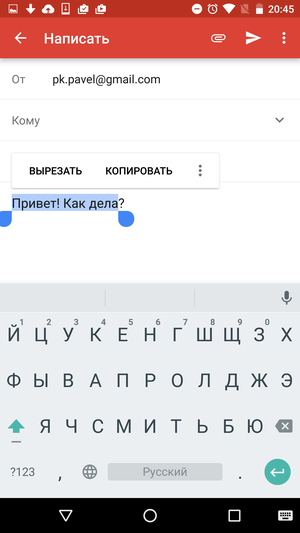
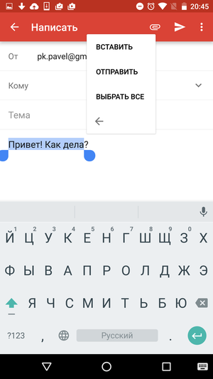
This change cannot be called global, but it makes working with text on the road noticeably more comfortable. Now, even shaking on public transport allows you to select the desired piece of text on the first try, without moving the cursor back and forth several times.
Back to content >>>
Direct Share
Direct Share is a cross between the system function 'share' and the good old 'copy / paste'. Now the selected text can be immediately transferred to the desired application, which eliminates unnecessary clicks and switching between windows of different programs. Thus, you can write a tweet with a quote from an article or send a chat correspondence to the mail in literally two clicks.


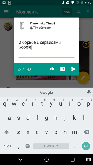
Everything works very simply – select the desired piece of text, select the 'Send' button and specify the desired application. True, at the moment, not all programs can boast of Direct Share support, but it's a matter of time. The revolution is not even close, but convenient.
Back to content >>>
Applications
It makes little sense to disassemble all system components Android in detail. The reason is very simple – most of them have long been brought to Google Play as separate applications. Anyone can download a branded keyboard, camera application, notes or calendar to their smartphone. Even the gallery application used for sorting and viewing photos is nothing more than a Google Photo client. And the update of these applications is weakly tied to the OS versions, in this regard they are no different from Google Maps or the Gmail client.
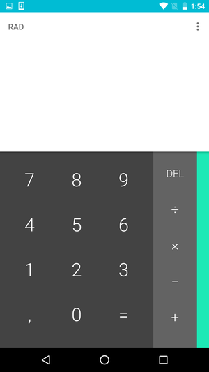
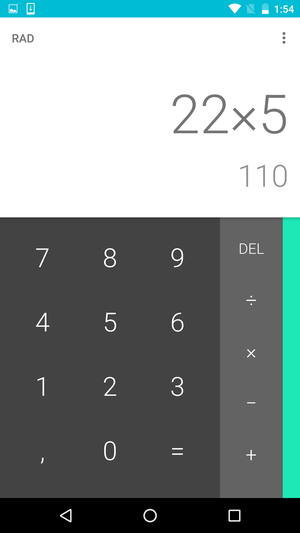
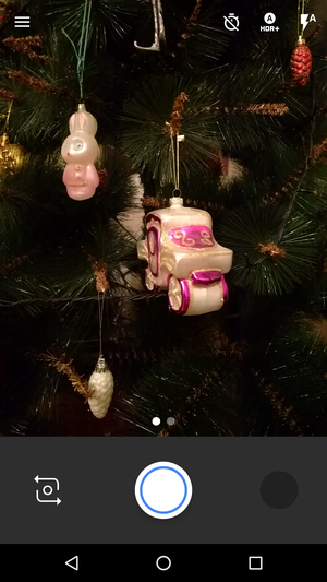
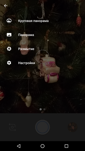

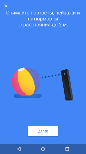
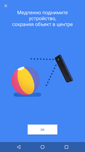
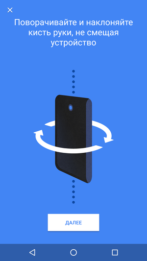
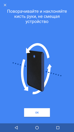
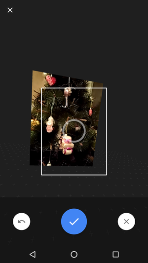
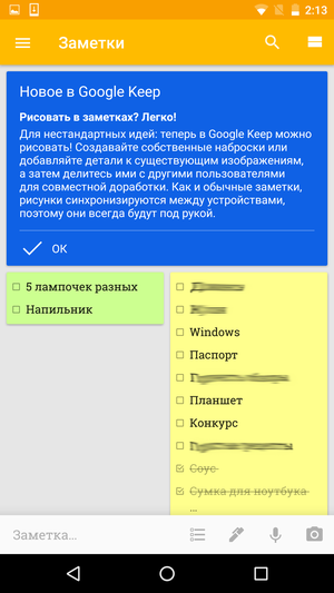

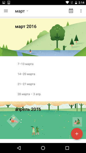

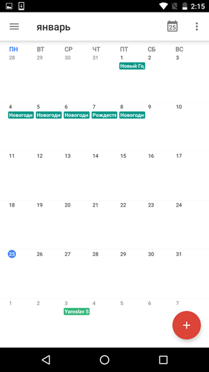
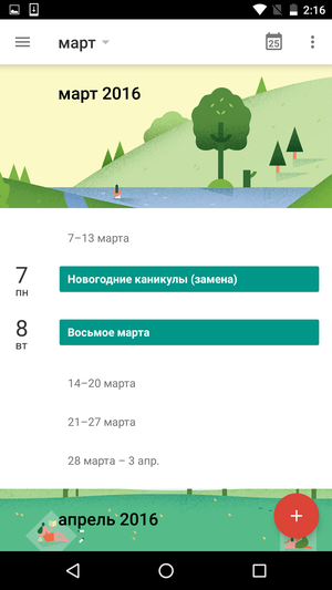

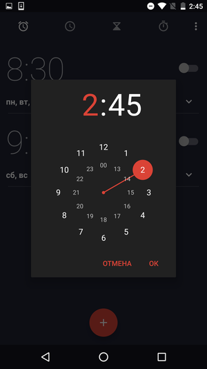
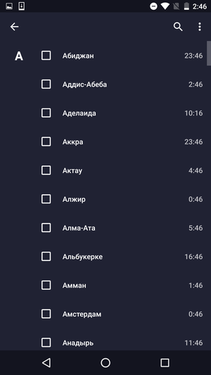
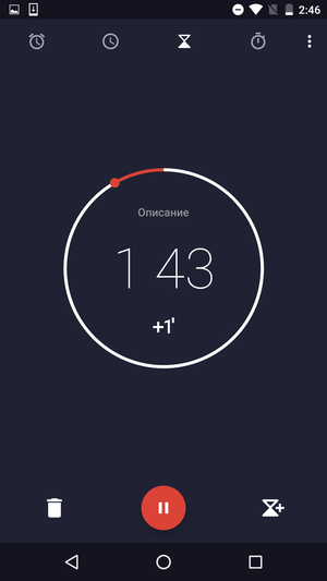
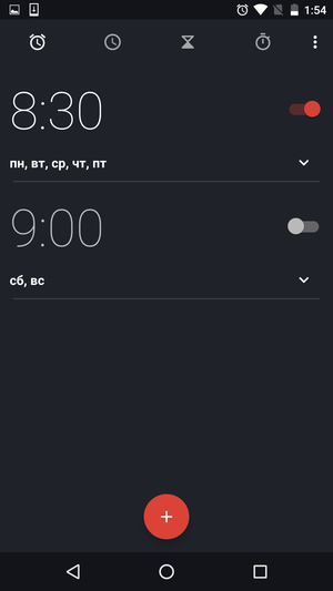
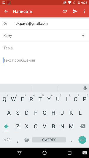
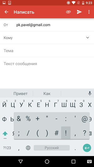
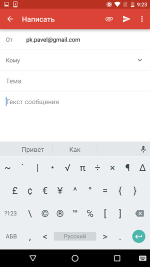
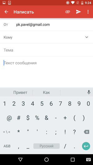
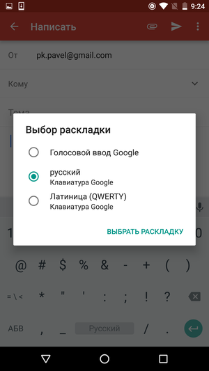
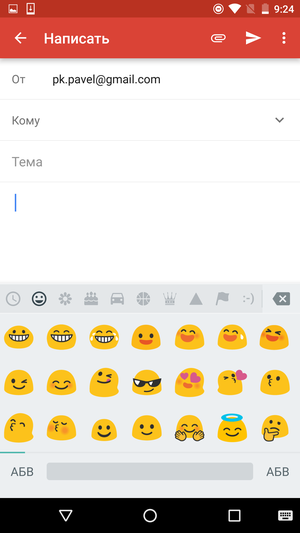
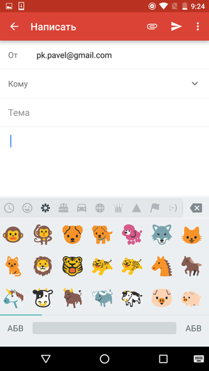


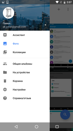
Perhaps the main exceptions here are the dialer screen and the address book, which cannot be downloaded separately from Google Play.
Back to content >>>
Dialer, address book
You can describe the address book in three words – convenient, beautiful, laconic. There are no special frills here, but this is probably not necessary.
The application interface is divided into three tabs. The first one contains a list of favorite contacts and an icon for calling the dialer keypad. The second is a list of recent calls plus the same keyboard icon. The last tab is reserved for the list of contacts. At the top of the screen is the search bar, which is displayed in all tabs.
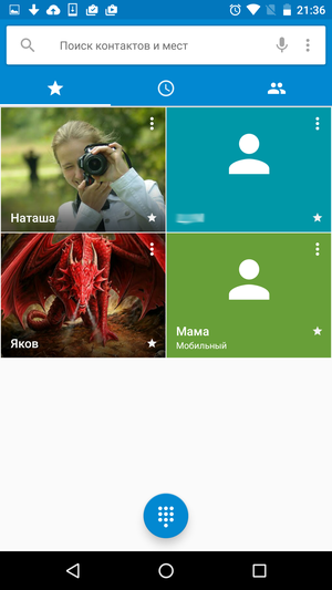


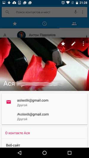


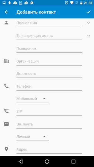
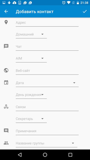
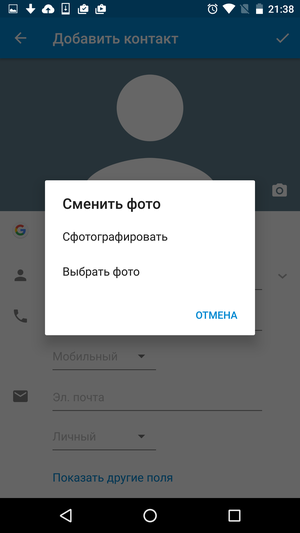
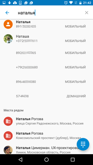
Of the pleasant moments, I would like to note the convenient sorting of the contact list (for example, by first name or last name), a list of quick replies, the ability to send an SMS message to the number entered from the numeric keypad with one click. In addition, the address book search is very well implemented, which understands that 'Natalia' and 'Natasha' are the same name.
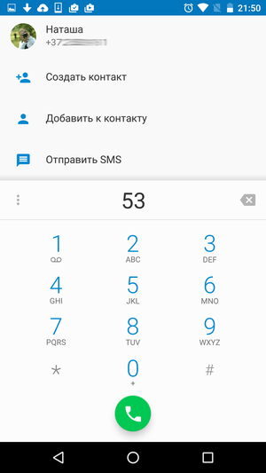
The downside is the lack of Russian letters in the dialer, which looks very strange.
Back to content >>>
Settings
No matter how good the smartphone interface is 'out of the box' and no matter how sensibly all its main functions are configured by the manufacturer, it will not work to please everyone in any case. Sooner or later, many users will want to change the ringtone, set up a password for the lock screen, add support for an additional language or see where all the free space has gone.
And here we come to one of the eternal problems faced by the manufacturer of any technical device. On the one hand, the user should be able to customize the device they honestly bought to their liking. On the other hand, a large number of functions, lists, menus and switches will only confuse most of the buyers. And some will even be so frightened. And do not forget about 'protection from the fool' – the intervention of an inexperienced user in the system settings often ends up contacting the service center and a bunch of negativity.
Google came up with a pretty interesting option. In the basic settings menu, only what is really needed by the bulk of users was left. A number of additional functions, which will be primarily interested in “advanced” users, have been moved to separate submenus, and some have even been hidden in an additional, “secret” section.
Back to content >>>
Wireless network
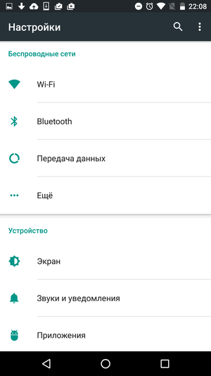
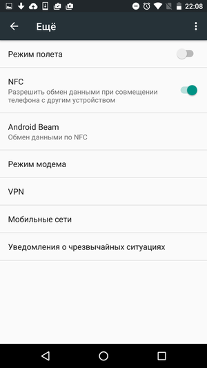
This section of the settings menu has remained largely unchanged for a long time. It is not surprising – all the necessary functions have been in it for a long time.
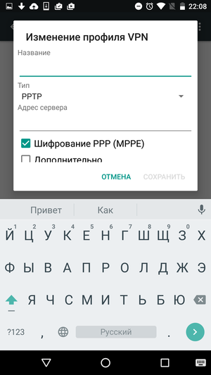
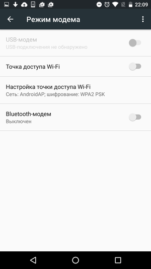
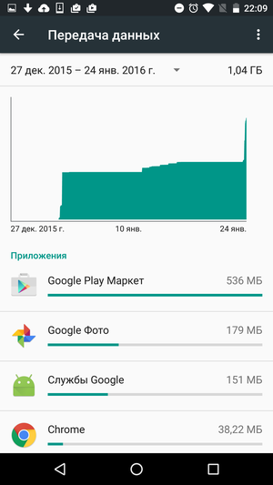
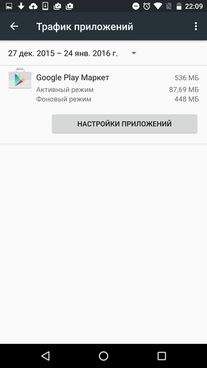
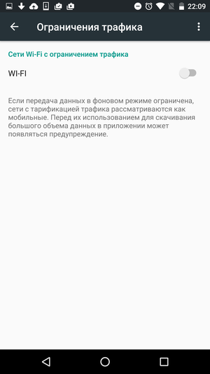
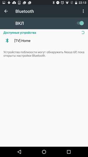
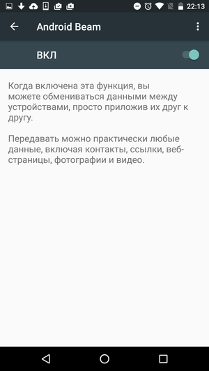
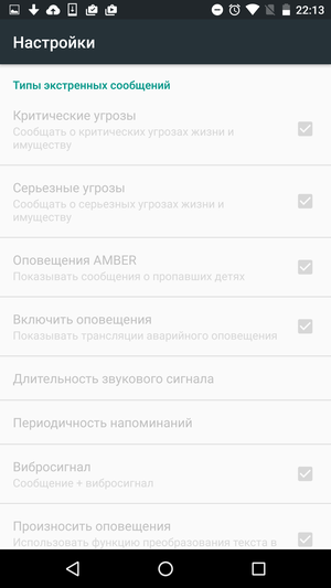
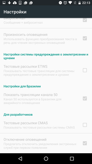
From here you can connect to a new Wi-Fi network or turn on other wireless interfaces (Bluetooth, NFC), connect to a VPN server, view the history of traffic consumption, or configure your smartphone to use as a wireless router. In the same section, you can configure the receipt of notifications about various emergencies, although here you need to see how relevant this is in general in your country.

Back to content >>>
Device
This is one of the largest sections of the menu and contains many sections with settings for every taste and color.
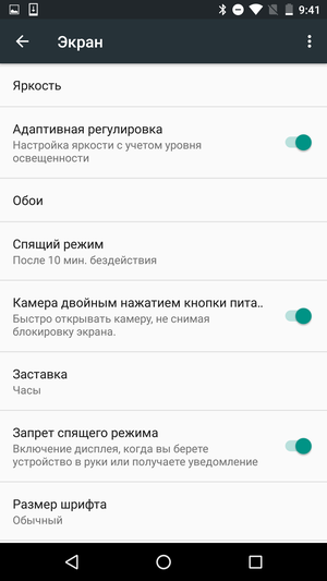
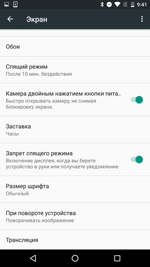
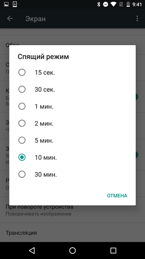
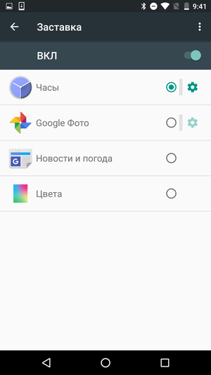
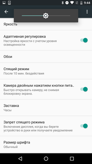
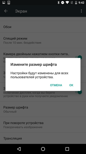
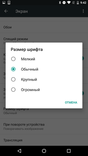
Section 'Screen'. In addition to the standard settings like choosing brightness, switching the device to sleep mode and choosing a wallpaper, there are a couple of more interesting options. First of all, this is the screen saver mode, which can be activated, for example, while the device is charging. And secondly, it is the ability to choose the font size, which allows you to comfortably use a device with any diagonal. Although some labels, such as labels for shortcuts to applications on the desktop, in any case have a fixed font size and do not change in any layouts.
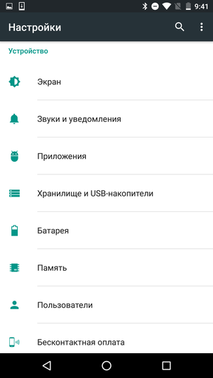
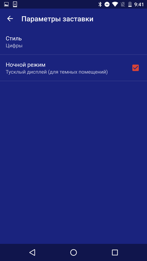
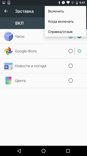
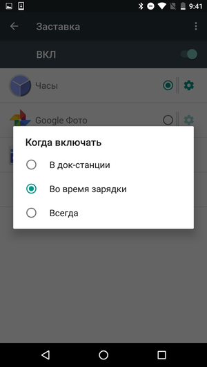


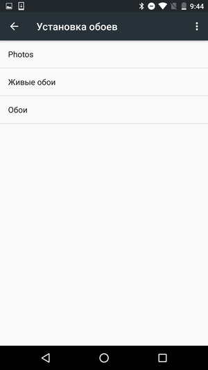


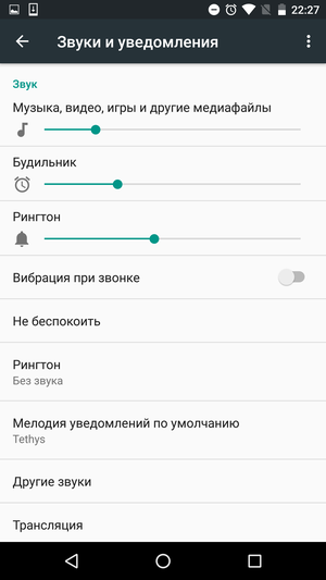
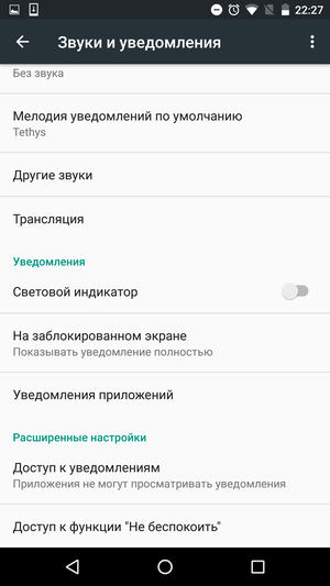
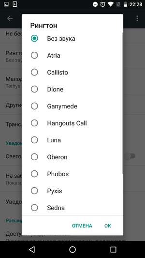
Section 'Sounds and notifications'. First of all, in this section, you can select ringtones and standard notification sounds. In addition, you can enable or disable a number of additional sounds: sound when dialing a number or screen lock, low battery alert, and others. In the same section, the behavior of the smartphone in the 'Do not disturb' mode is configured in detail, including you can divide applications into 'Important' and 'Unimportant', and also specify what kind of notifications you can receive from them.
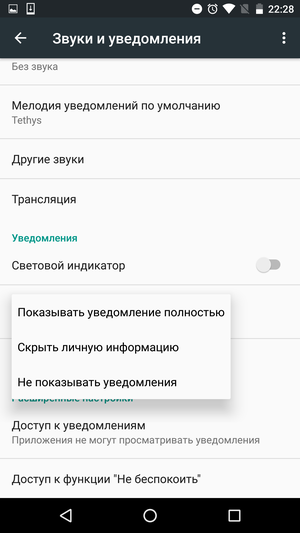

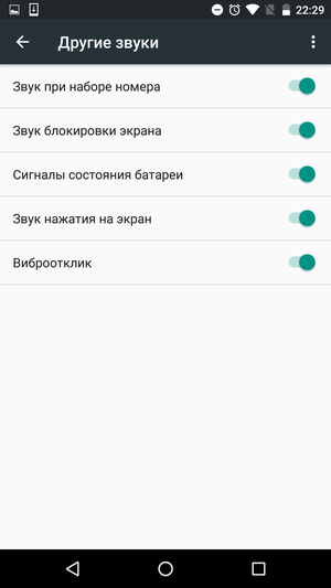
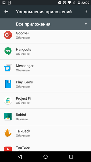
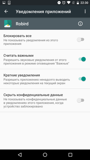
Section 'Applications'. This section contains information about the applications installed on the smartphone: how much each application consumes disk space and how much it has transferred data over the Internet, how actively it uses the battery, and so on.
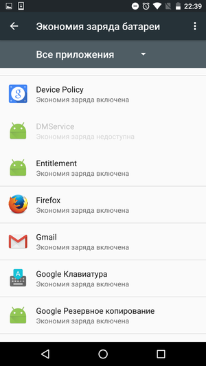
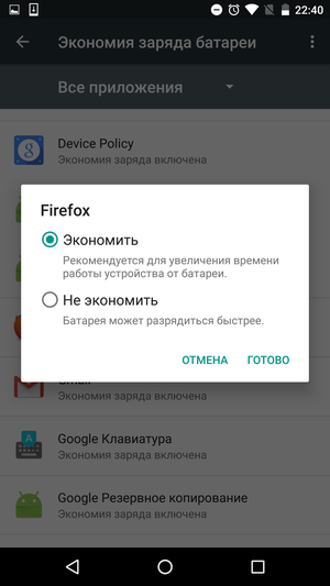
Tap on the gear icon in the upper right corner of the screen opens an advanced settings section, which most users will not need. In it, you can configure the battery saving mode separately for each application, grant new permissions, see which applications can influence the system settings of the smartphone, and so on. The default applications are also selected here. For example, if you have two different browsers or several music players installed on your smartphone. And, unlike earlier versions Android, you can immediately see which application is used for what, you do not need to look for them in the general list.
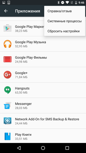
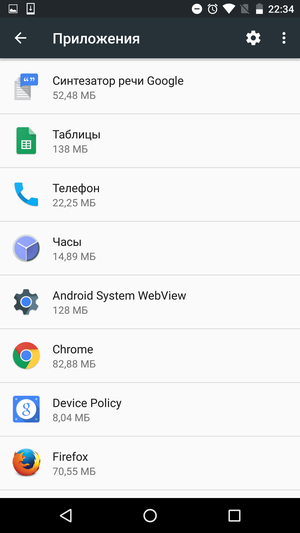
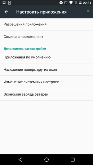
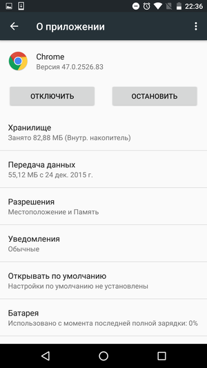
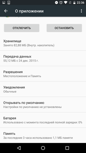
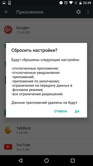
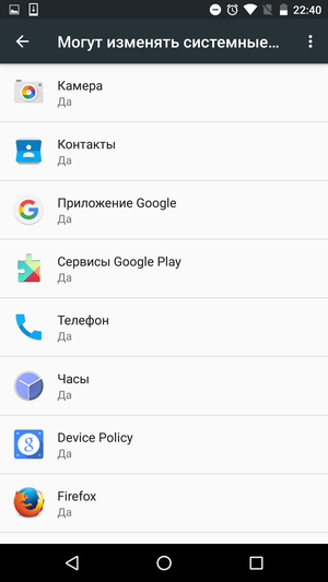


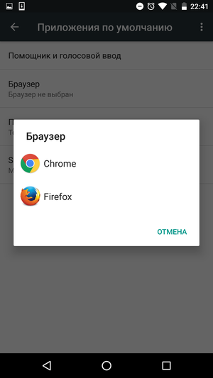
If something went wrong and the smartphone began to behave somehow strangely, it is possible to reset all the settings of the installed applications at once to the standard ones. In this case, neither the applications themselves nor their data will be deleted.
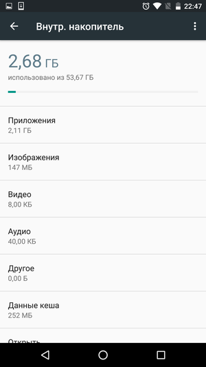
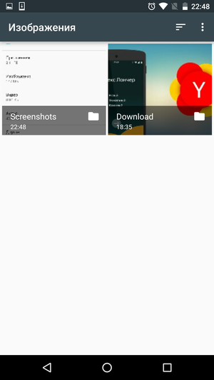
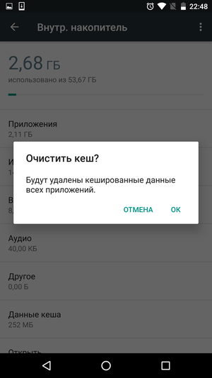
Section 'Storage and USB drives'. It is here that you can find out where all the free space went. And at the same time, free it by clearing unnecessary data. To go to the list of files from a particular category, just click on the corresponding line, which is very convenient. Or, alternatively, just open the file manager. In addition, you can delete the cache of all installed applications – this should not lead to problems, but you will hardly be able to clear the space for a long time.

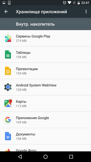
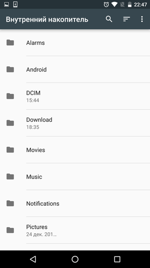
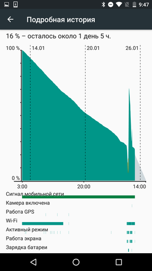
Section 'Battery'. Battery life is a sore point for all modern smartphones. Someone lives on one charge more, someone less, but these days you don't even have to dream of the performance of push-button 'dialers'. Google clearly understood that a lot of users would look into this section and tried to make it as informative as possible.
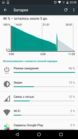
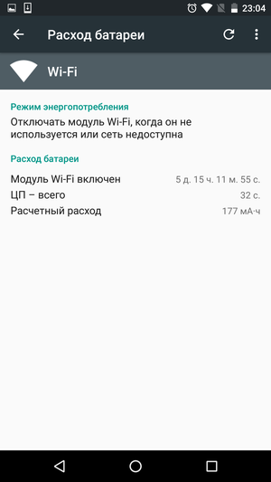
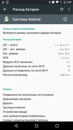
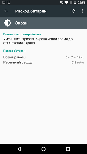
In the upper part of the screen there is a graph of the battery discharge, the actual data is shown in dark color, and the forecast for the next hours is shown in light. Below is a list of the most 'gluttonous' applications, tap on the name of the program allows you to view detailed information on it. In many cases, users are given advice on how to save battery power in this case. For example, in the case of a screen, this will be a decrease in brightness or operating time before shutdown, and in the case of a Wi-Fi module, it will be forced disconnection from the network in standby mode. Moreover, you can literally go to the corresponding section of the settings 'in one click' by simply clicking on the hint.


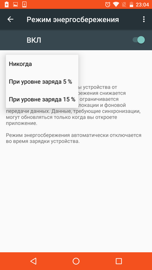
The last argument of the kings in the battle with the battery is the power saving mode. It can be turned on both manually and automatically, at a certain charge level. Unfortunately, you cannot independently specify the threshold for enabling it, you can only choose one of the two available options.
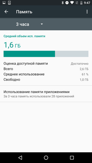
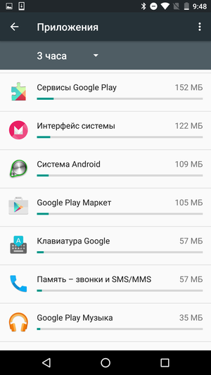
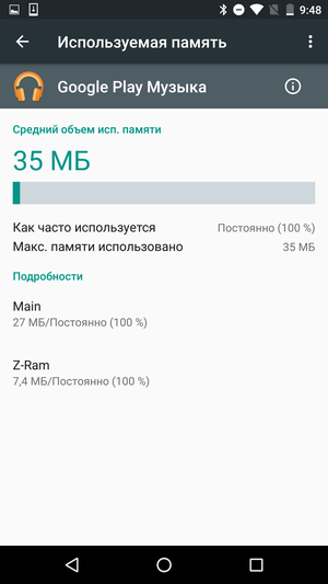
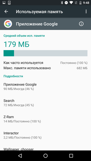
Section 'Memory'. Although this is not entirely obvious from the title of the section, in this case we are talking about RAM, not built-in memory. In Android 6.0, users have the ability to track memory consumption by specific applications, before that they had to install third-party software for these purposes.
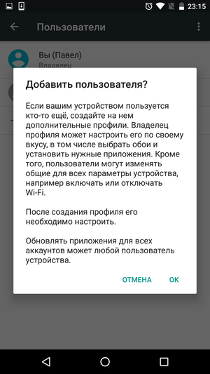
Section 'Users'. Support for multiplayer mode appeared in one of the previous versions Android. I don't know how necessary it is on smartphones (after all, a phone is a personal device), but on tablets it clearly came into play. Each user can safely use the device without disturbing others.



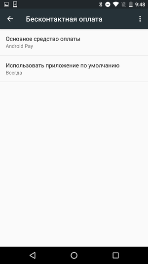
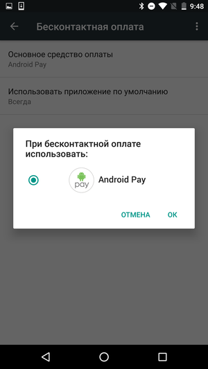
Section 'Contactless payment'. The section dedicated to the contactless payment function using Android Pay.
Back to content >>>
Personal data
The second largest settings section. Although it contains a number of important parameters, often few people will look here. For the most part, it is enough just to customize everything once to your taste and never come back to these questions.
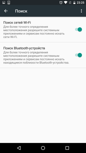
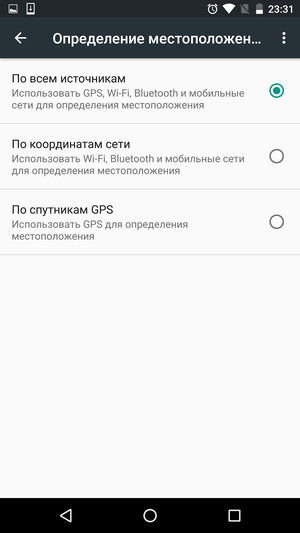
Section 'Location'. On this screen, you can check which apps have recently tried to find your location. And at the same time – how much battery charge they were using. Here you can configure the methods for determining the geolocation or generally disable this function globally.
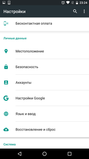
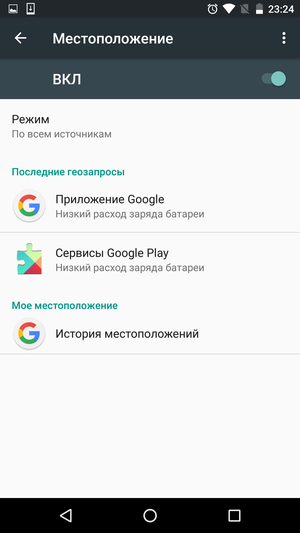
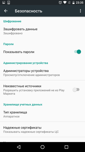
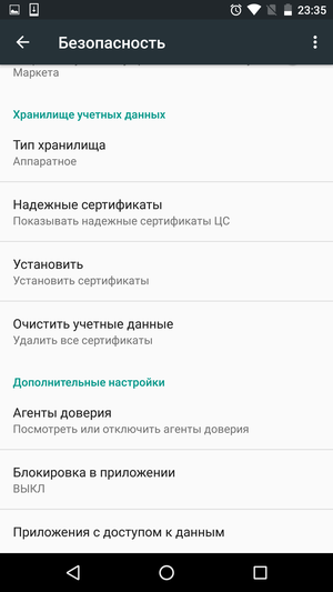
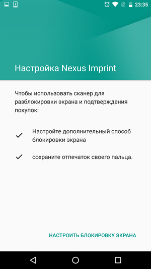
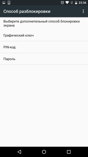
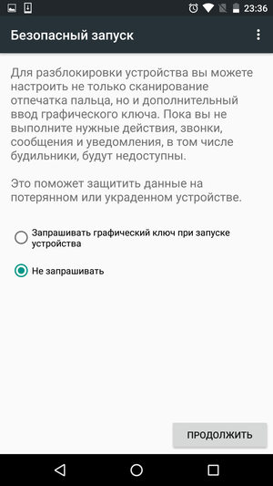
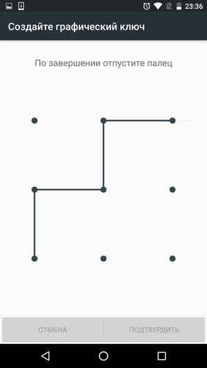
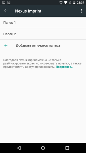
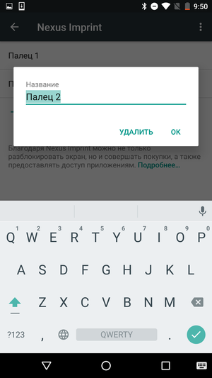
Section 'Security'. The main thing for which they enter this section is the password for unlocking the smartphone. This can be a pattern, PIN, password, or fingerprint scan.
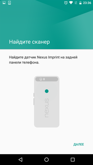
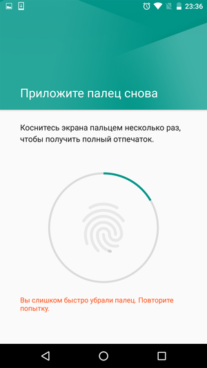
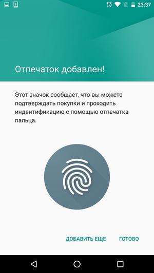
Although fingerprint scanners were found in Android smartphones before Android 6.0 was released, it was in this OS version that they began to be supported at the system level. The function is called Nexus Imprint and is used primarily to quickly unlock the screen and confirm payment for purchases. How it works is shown in the screenshots below.
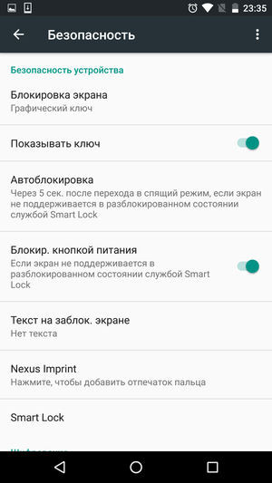
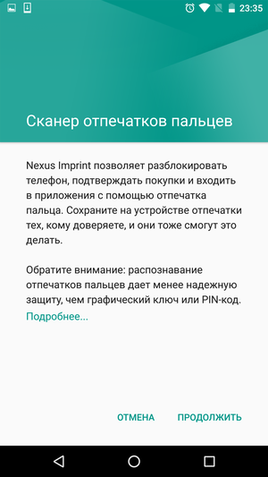
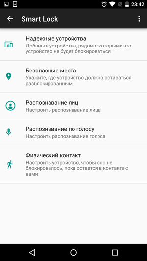
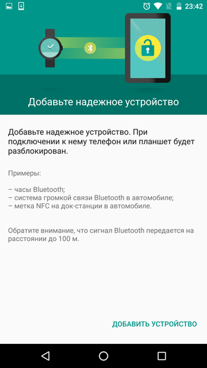
Besides the fingerprint scanner, the Smart Lock feature is quite interesting. Or rather, a whole set of functions hiding under one name. With their help, you can turn off the device lock in the places of your choice (at home, at work, etc.), configure the smartphone so that its screen does not lock as long as the device is in your hand, turn on the face or voice recognition function, and etc.
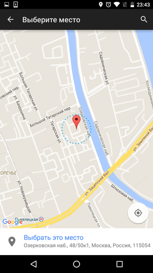
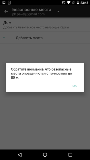


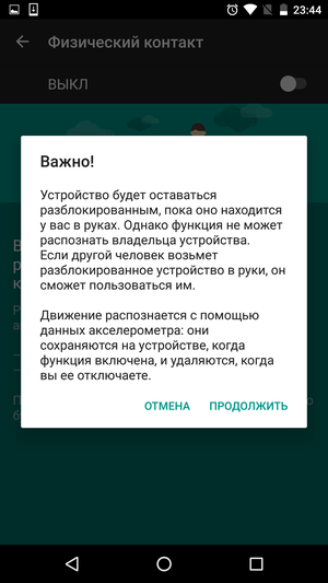

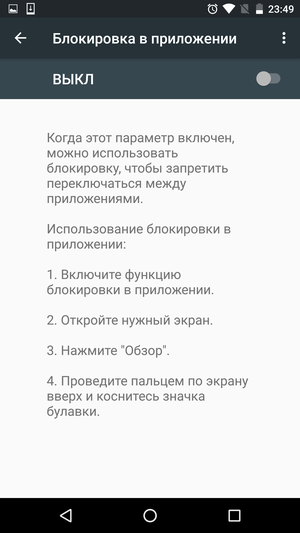
Another interesting feature is the setting of blocking for switching between applications. With its help, you can let your friend read an article open on the screen without fear that he will secretly crawl into your SMS correspondence or copy messages from your corporate mail. And to fix and unpin the screen is a matter of literally two clicks.

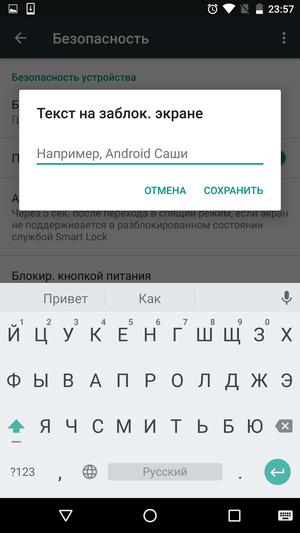
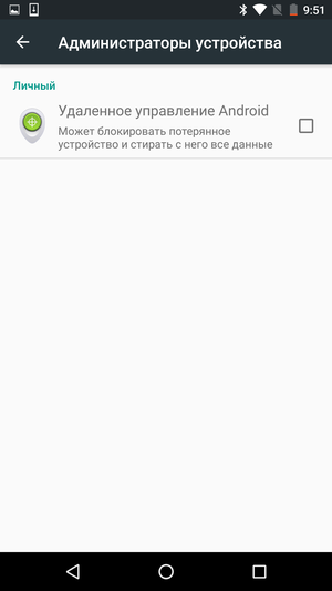
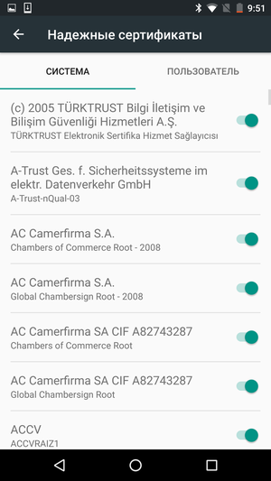
Among the remaining features, it is worth noting the installation of applications from third-party sources, which allows you to download and install applications from third-party sites, the ability to display arbitrary text on the lock screen and settings for disabling the screen lock with the power button.
Section 'Accounts'. List and setup of accounts from different services, including the main Google account.

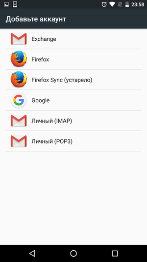
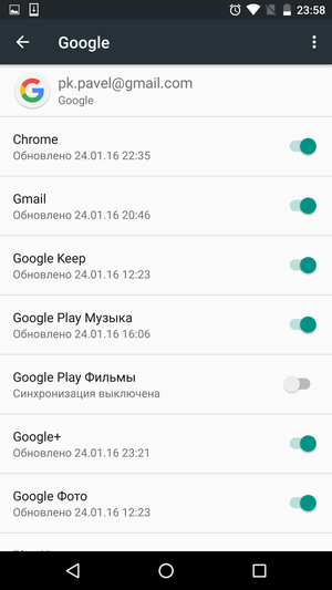
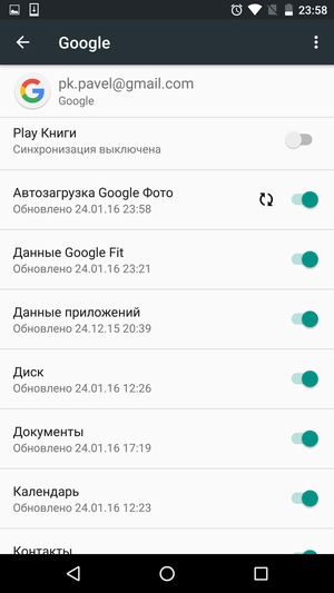
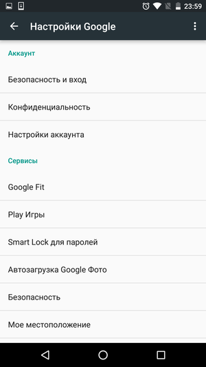
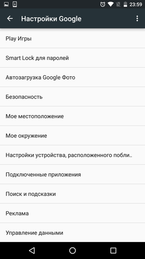
Section 'Google Settings'. A list of settings for various Google services. For example, from here you can quickly turn on auto-sync for photos in Google Photos, go to Google Now preferences, connect a Google Fit app or device, and more. On the one hand, it is convenient that everything is gathered in one place. On the other hand, it is very easy to get lost in a bunch of menus and transitions. And all this has only an indirect relation to the OS itself.
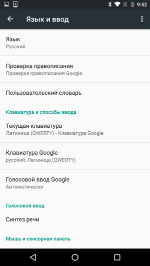
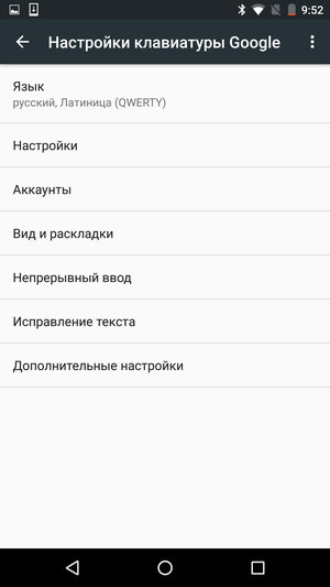
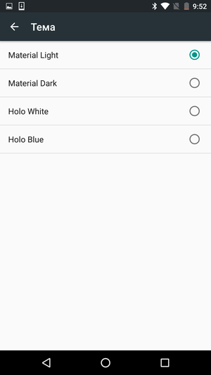
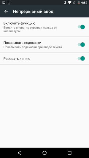
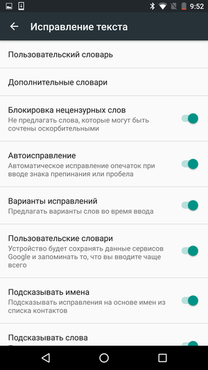
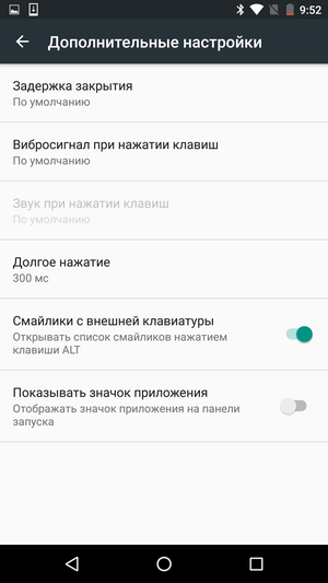
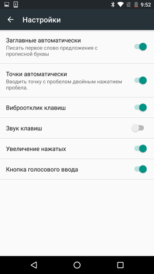
Section 'Language and input'. Standard keyboard and voice input settings, selection of supported languages, spelling checker and custom dictionary settings. Here you can also choose which of the available keyboards to use.
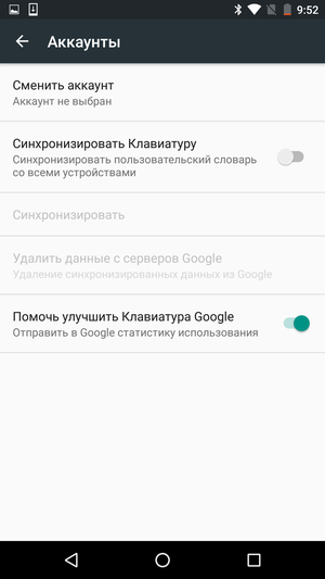
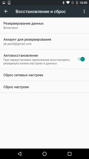
Section 'Restore and reset'. A data backup system is something that has been lacking for many years Android. But how much all this splendor will work in practice is an open question, because much here depends on the application developers themselves.



Back to content >>>
System
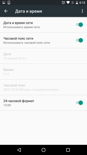
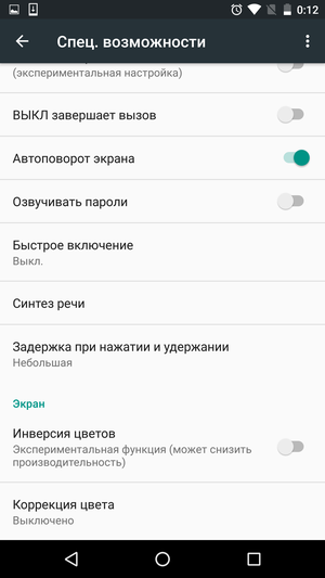
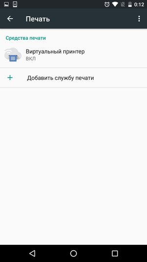
Here you can set date and time options, enable accessibility features (large font size, color correction mode, color inversion, and more), set up print services, and view general information about your phone.
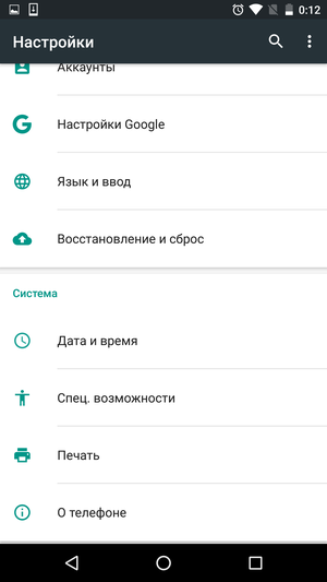
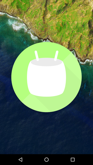
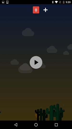
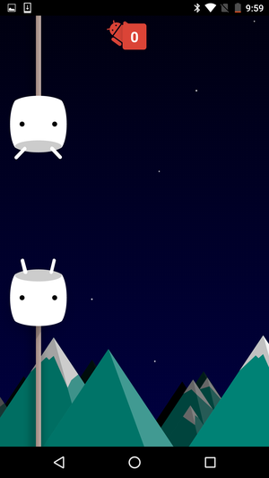
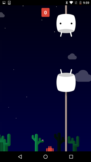
From the funny moments – a secret “Easter egg”, which can be discovered by tapping the OS version number several times in a row. This time it's a simple minigame like Flappy Bird, which will quickly show that your previous taps on the screen are nothing more than a warm-up. For those who value their nerves, I strongly do not recommend turning it on – most likely, you will want to smash a brand new smartphone against the wall in a dozen minutes.
Back to content >>>
Hidden settings
In the last section of settings there is one more section hidden from the eyes of users. Although, in fact, it is not difficult to activate it – just press and hold the gear icon for a few seconds, which is located on the switch screen in the notification panel shutter.
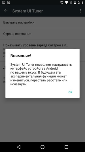
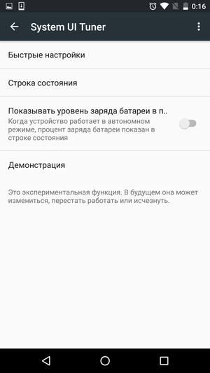
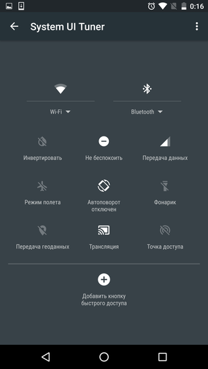
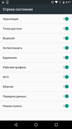
There are several interface settings that Google, for some reason, did not dare to expose to the public. Moreover, the company honestly warns that all of them can be disabled at any time.
In fact, what this secrecy is connected with is not very clear. After all, not only is there nothing dangerous, but even unusual in the options available here. First of all, we are talking about the possibility of sorting the switches in the curtain of the notification panel. In addition, you can select the system icons that appear on the status bar. The last is the setting for displaying the battery charge – it can be displayed both in the traditional way and as a percentage.
The very idea of the hidden section of the interface settings is interesting, but its contents are not yet impressive. Was it worth building a garden for a couple of simple options?
Back to content >>>
Outcome
As expected, there were no major changes in the interface design Android. It's still the same good old Material Design, even if somewhat improved and supplemented. In particular, the animation has been noticeably redesigned (and for the better), which immediately catches the eye. As for the rest, the main interface change was the new applications menu, which became something between the classic menu Android and the familiar Windows Start button.
There are not so many new system functions, but they all came to the right place. Application preferences backups, a new permission management system, improved power saving modes, and a highly customizable Do Not Disturb mode – all of this is exactly what was worth adding to Android for a long time.
In general, Android 6.0 can hardly be called a revolution, and whether there is still room for something fundamentally new in modern mobile operating systems is an open question. The update turned out to be calm, but pleasant at the same time. It is definitely not necessary to worry very much that your smartphone has not received a firmware update to a new version of the OS, but it is also not worth thinking about whether to install an available update for a long time. After all, Marshmallow is, albeit not the biggest, but still a confident step forward.

