Based on materials from www.neowin.net
One of the UI / UX designers Microsoft came up with a complete concept of what Office would look like on Android smartphones if the company ever started sticking to Google's material design.
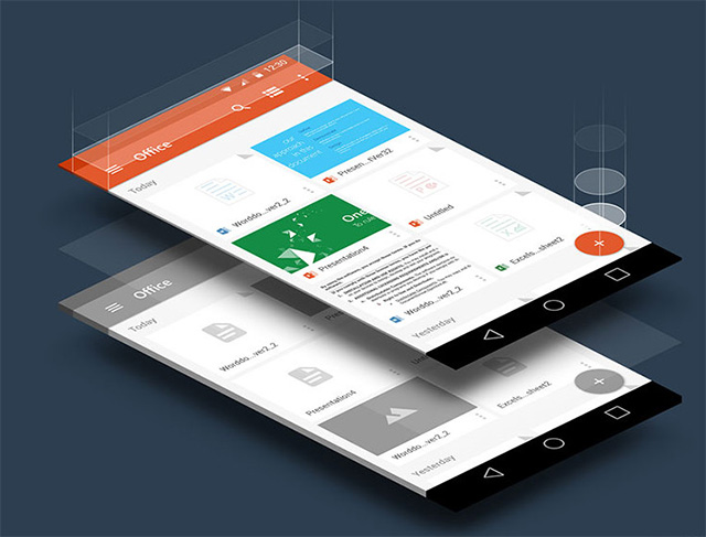
Last year, at the next Google I / O conference, the principles of a new design language were announced. 'Material Design' took hold with the release of Android 5.0 Lollipop, and application developers immediately started updating them to meet the new requirements.
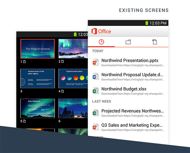
The current Office interface for Android looks a little dated compared to those apps that follow Material Design principles. And it is unlikely that Microsoft will release an update in the near future, since the company is now busy with other versions, such as Office Touch and Office 2016.
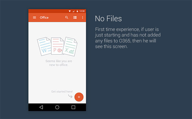
Meanwhile, Sudeep Phase from India Microsoft attempted to give an idea of what Office might look like when redesigned for material design.
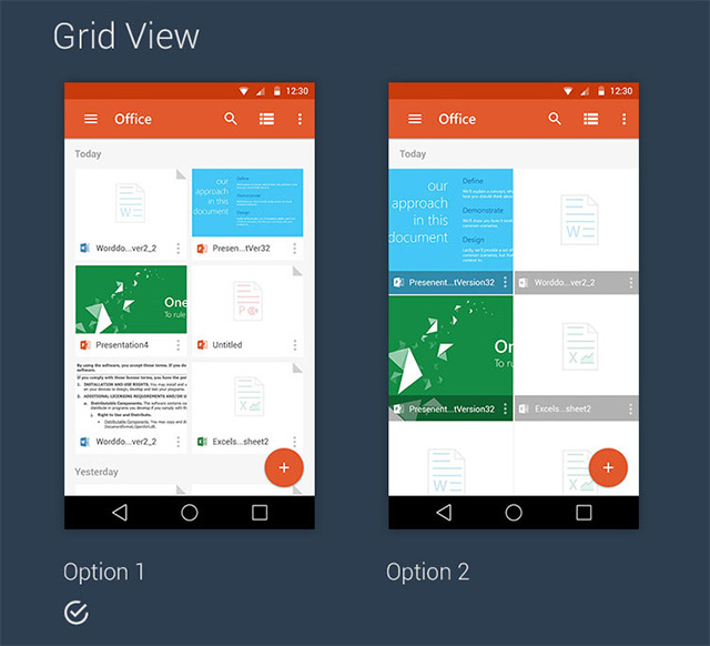
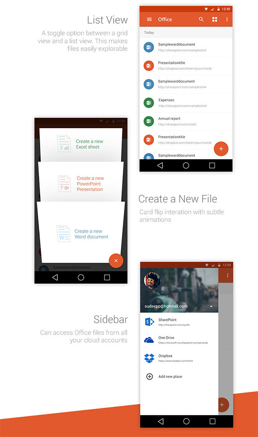
In the grid view, the files are displayed with the corresponding thumbnails, here there is also the required Floating Action Button (FAB) according to the new instructions.
Then there are a number of new elements, such as a redesigned navigation bar and a file cabinet of open files.
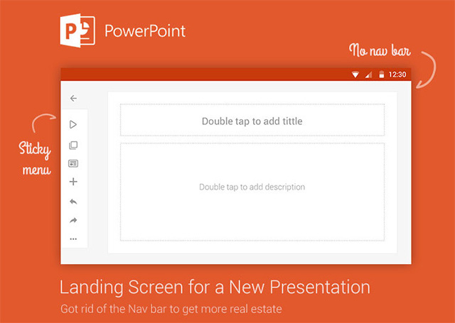
Not all Office applications were affected by the changes, but Power Point got a lot of attention. Below it is presented in landscape orientation.
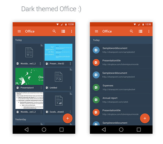
And finally, a dark theme for Office, just for those times when you work in the dark and can no longer look at the bright screen.
You can see a little more here. And at the same time share your opinion in the comments – do you think the office needs a material design rework?
